

GearMart Theme
Aero Theme GearMart Documentation
Install GearMart
A professional guide for installing the GearMart theme on your Shopify store.
Try the GearMart Theme from the Shopify Theme Store for Free
If you would like to explore the GearMart theme before making a purchase, Shopify allows you to try it with your store. This provides the opportunity to see how the theme looks and functions with your products and branding. Follow these steps:
Buy GearMart Theme from Shopify Theme Store
You can only publish themes to your online store after purchase. Once you purchase a theme from the Shopify Theme Store, it is licensed exclusively to the store where the purchase was made.
Step 1: In your Shopify admin, click Online Store > Themes..
Upload a Theme File from Your Computer
Important note: We strongly recommend purchasing and installing themes directly from the Shopify Theme Store for the best experience. This ensures you receive automatic updates, official support, and proper licensing. If you have a theme in a ZIP file on your computer, you can upload it to the Themes page in your admin. Before you upload, ensure that your theme files are compressed into a single ZIP file.
Update GearMart:
Update the Theme Automatically
1. Check Notifications on Shopify
In your Shopify admin, go to Online Store > Themes. If a new version of the GearMart theme is available, you’ll see a notification in your theme library.
2. Review Update Details
- Click the notification to view more details about the update.
- Select View release notes to read what’s new in the release.
3. Add to Theme Library
Click Add to theme library to download and add the updated version of GearMart to your Shopify store. The updated version will now appear in your theme library, ready to customize and publish.
Troubleshooting: No Update Notification?
If you don’t see an update notification, it could be due to code customizations conflicting with Shopify’s update system. In this case, you can manually reinstall the theme.
1. Reinstall the Theme
Download the latest version of the GearMart theme from the Shopify Theme Store and upload it to your store (instructions below).
2. Manually Transfer Customizations
Any custom code or third-party app snippets will need to be re-implemented in the new version.
Preparing for the Update: Create a Backup
Before updating your theme, always duplicate your current theme to create a backup. This ensures you can restore your store if something goes wrong.
Step 1:In your Shopify admin, go to Online Store > Themes..
Upload the Latest Theme Version
Once you’ve downloaded the updated GearMart theme from the Shopify Theme Store, upload it to your Shopify store.
Step 2: In the Theme library, select Add theme > Upload zip file.
Step 3: In the Upload theme modal, click Add file and select the file you want to upload.
Step 4: Click the Upload file.
Move the Theme Settings and Pages
After uploading the new theme, transfer your settings, custom templates, and modifications to the new version.
Step 1: Go to your current theme, click Actions > Edit code.
Step 2: Copy the following files from the old theme and paste them into the same folders in the new version:
- All edited JSON files in the Templates folder.
- The settings_data.json file is in the Config folder.
Step 3: Re-create custom templates (if any).
Re-install Apps
Any apps that add code to your theme’s files will need to be reinstalled. This can be an automatic or manual process, depending on the app, so confirm with the app’s developer whether removing and adding the app is enough to connect with the new version.
Find the app documentation in the App Store to follow the installation instructions.
If you’re unfamiliar with this process, you can go to Apps > click View details to find the support email for that Shopify app.
Theme License & Transfer:
Theme License & Transfer
Unlicensed themes do not qualify for support or theme updates.
For more detailed information on licensing, refer to
Unlicensed Theme Use
- Purchase: Buy the theme for the store where you plan to use it. For the best experience, purchasing GearMart is the ideal choice.
- Remove: If you decide not to purchase the theme, you can simply delete it from your theme library.
- Transfer: If you previously purchased the theme for an old store that is no longer in use, you may have the option to transfer it to your new store.
Can I Import a Theme from a Different Store?
How Do I Transfer a License?
1.1 Header Group
1.1.1 Top Bar
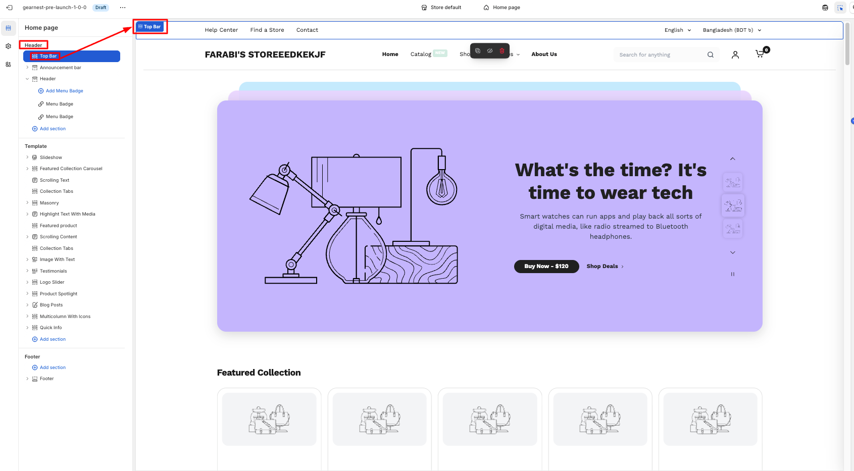
How to add a Top Bar to your Shopify store
- On the left side of the theme editor, find the header section, then click on the top bar.
- Make necessary changes.
- Add a top bar
- Configure each bar.
- Save
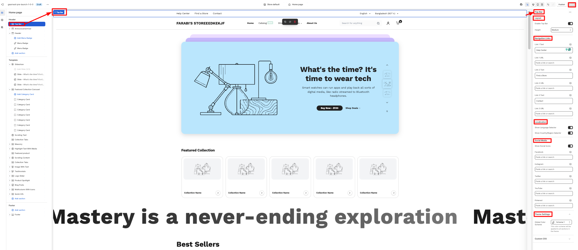
How to configure each top bar
- Click on the top bar and configure it from the right side of the theme
- Then they need to select the navigation links of the items in the top bar.
- The users can choose to enable the country and language selector
- They can also choose to display the social icons
- Lastly, on the theme settings, they can customize the global color scheme.
- Then need to align the content from the content alignment.
- Save
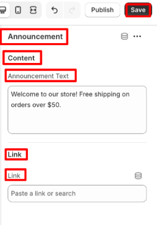
1.2.1 Announcement Bar
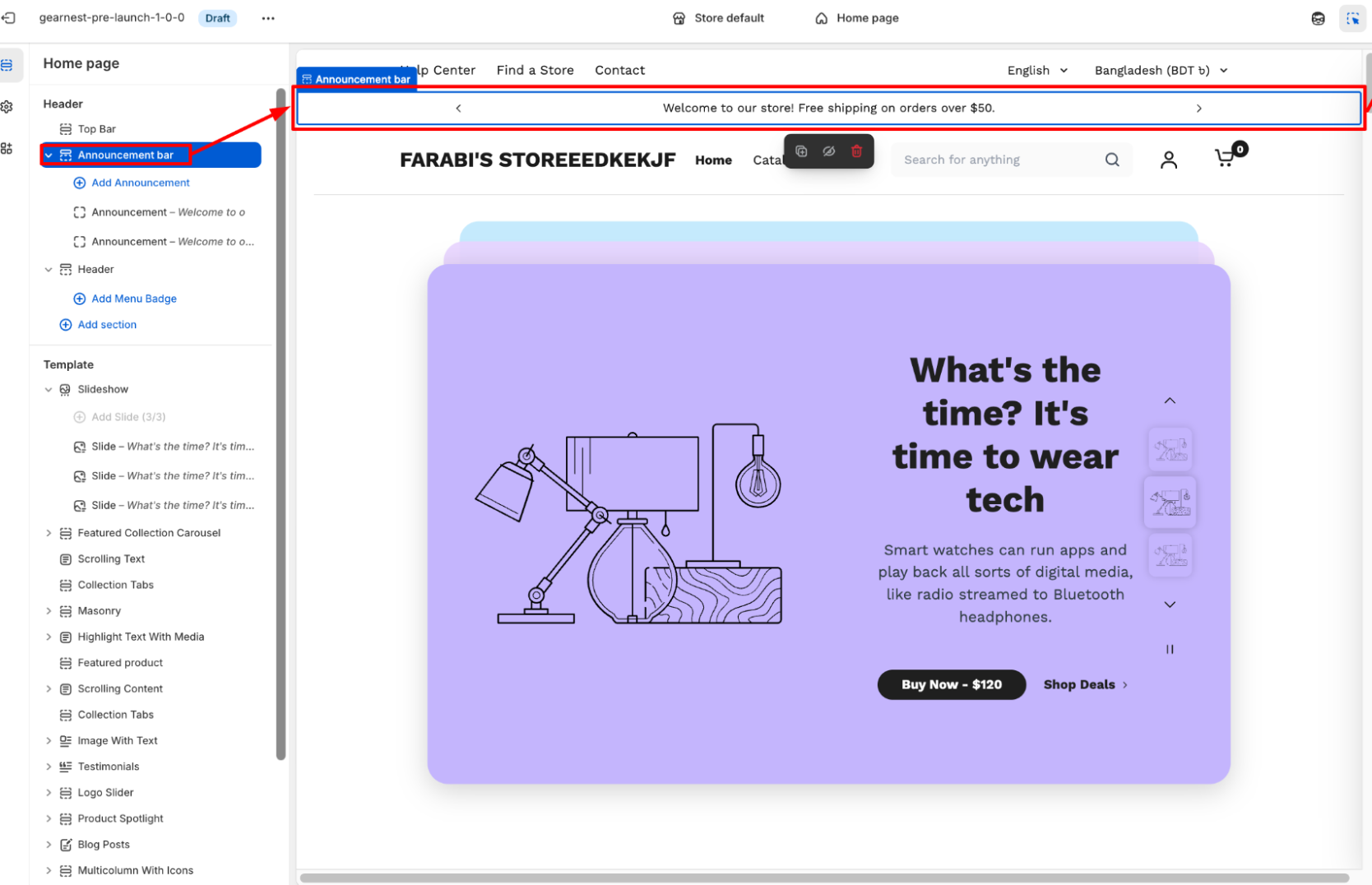
How to add an Announcement bar section to your Shopify store
- In the theme editor (Customise), navigate to the Header group and click Add section.
- Select the Announcement bar.
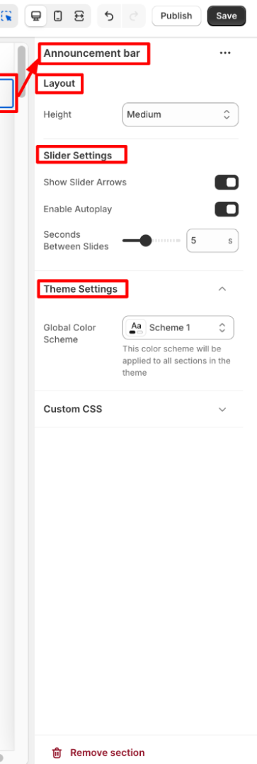
- Configure the announcement bar, slider, and theme settings on the right panel.
- Save
How to add an Announcement bar section to your Shopify store
- Then add the announcement bar block.
- Click on the announcement bar block, and an editor panel will appear on the right.
- Make necessary changes in the content and link.
- Save the settings.
1.1.2 Header
In a Shopify theme, the header is the top section of every page — it’s visible across the entire store and plays a major role in navigation, branding, and user interaction.
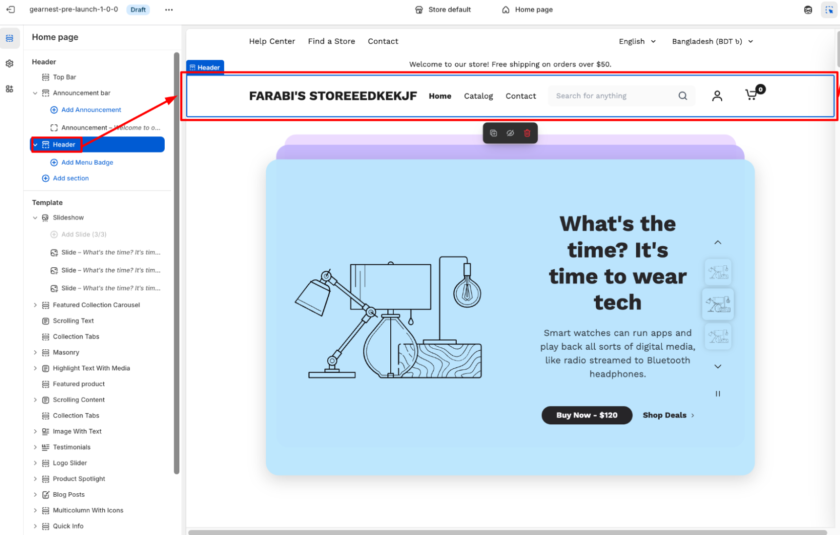
How to add a Header section to your Shopify store
- In the theme editor, navigate to the Header group and click Add section.
- Select the Header.
- Make necessary changes to the layout, navigation, search, icons, and theme settings. .
- Save
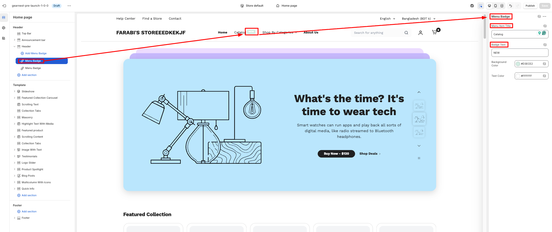
How to add a menu badge
- 1. Click on the individual menu badge and configure each badge from the right side of the theme.
- 2. The user needs to write the menu item title from the nav bar items and badge text.
- 3. Then need to select a background color and text color for the badge
- Save
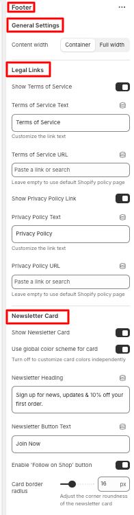
1.1.3 Footer
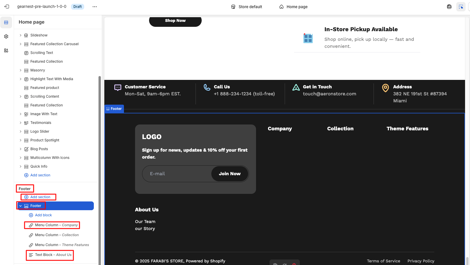
How to configure the footer
- On the left side of the theme editor, find the footer section, there click on the footer.
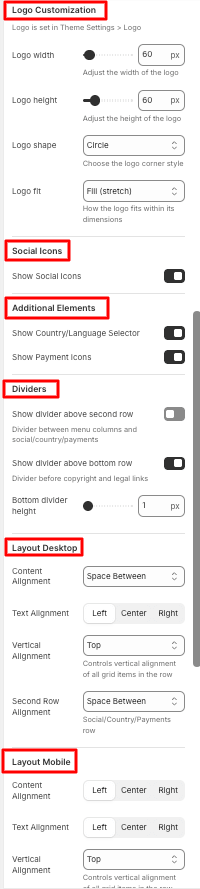
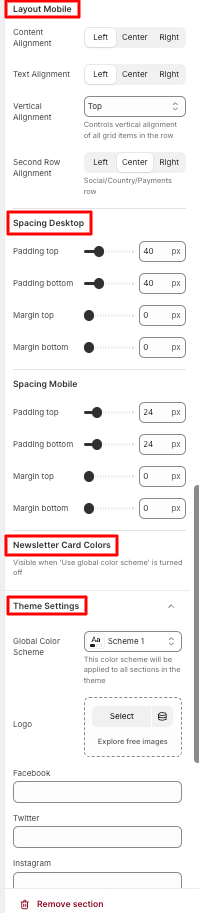
- Make necessary changes to the general settings, legal links, newsletter card, and logo customization.
- Users can also enable social icons and show country/language selectors along with payment icons.
- They can customize dividers and layout, spacing on both desktop and mobile
- The newsletter card colors can be modified
- Lastly, they can change the global color scheme in theme settings.
- Save
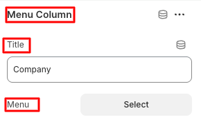
How to add and configure the Menu Column Block
- Click on add block under the footer section and add a menu column
- Configure the title and select the menu
- Save
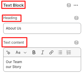
How to add and configure a Text block
- Click on Add block under the footer section and add a Text Block
- Edit the heading and text content
- Save
2.1 Slideshow
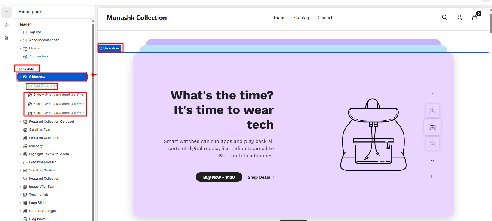
How to add a Slideshow to your Shopify store
Steps:
- On the left side of the theme editor, find the template section, there click on the Slideshow./li>
- Make necessary changes.
- Add slides one by one ( 3 slides)
- Configure each slide
- Save
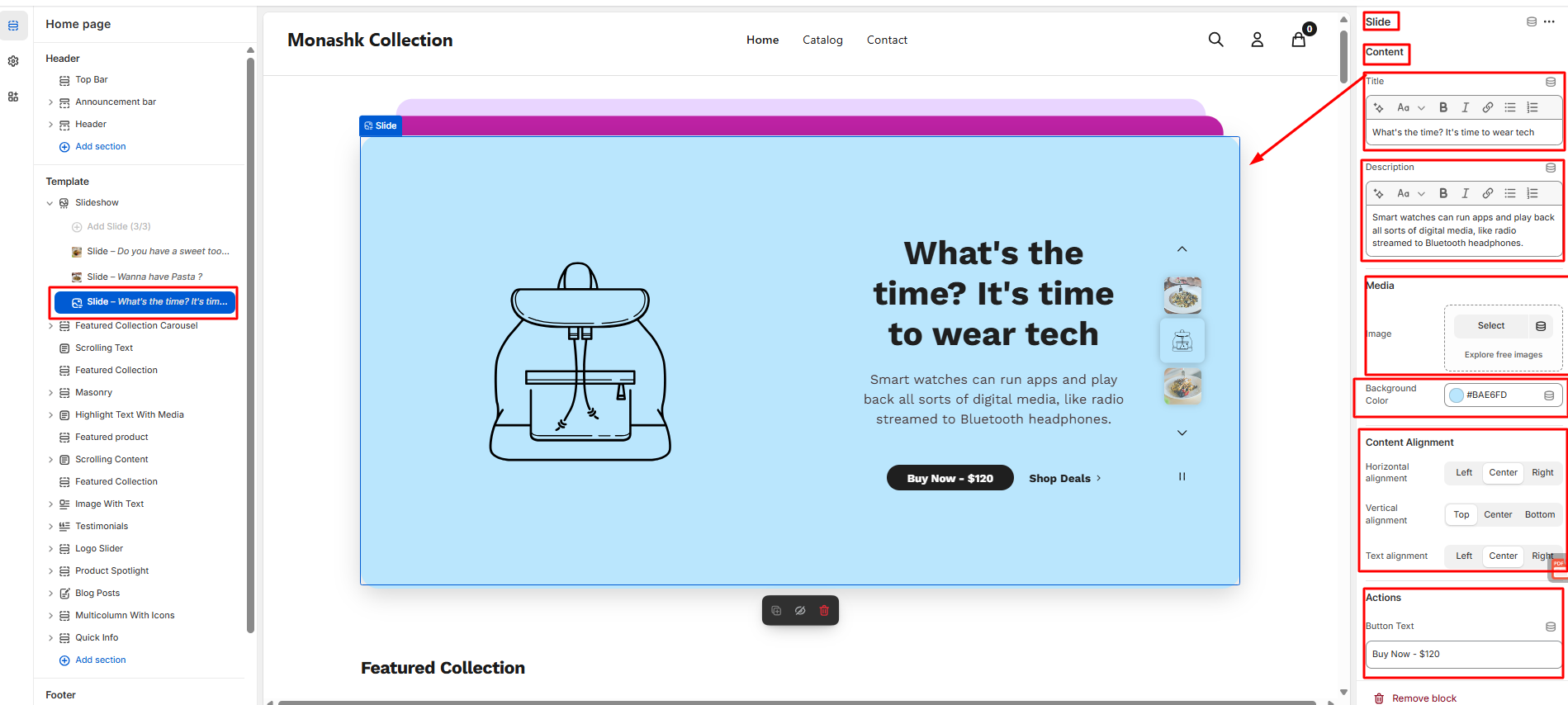
How to configure each slide
- Clicking on the individual slides and configuring each slide from the right side of the theme
- The user needs to write the content in the title and give a brief description in these sections.
- Then need to select an image and choose a background color from the Media section.
- Then need to align the content from the content alignment.
- Moreover user needs to set the button text, link, link text, along link URL from the action section.
- Save
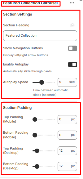
2.2 Featured Collections Carousal
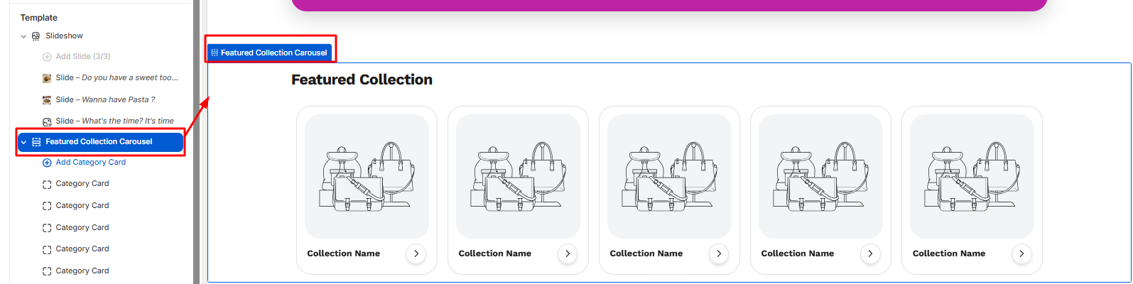
How to add Featured Collection Carousal to your Shopify store
- On the left side of the theme editor, find the template section, and click on the Featured Collection Carousel.
- Click on the right side of the theme editor, make necessary changes in section settings, starting from the heading to the auto-play speed.
- Then the user needs to select the padding section for both mobile and desktop.
- Save
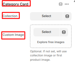
How to add Multiple category cards in the Featured Collection Carousel
- Click on the add category card, then make the necessary changes from the right side of the theme editor.
- Select the collection page and image from the custom image.
- Save the settings.
2.3 Scrolling Text
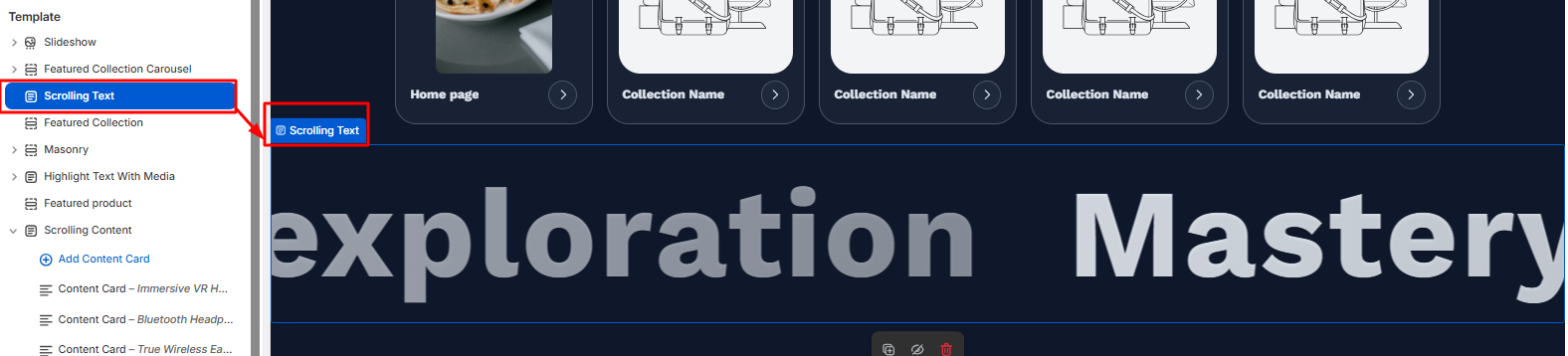
How to configure Scrolling Text
- On the left side of the theme editor, find the template section, there click on the scrolling text.
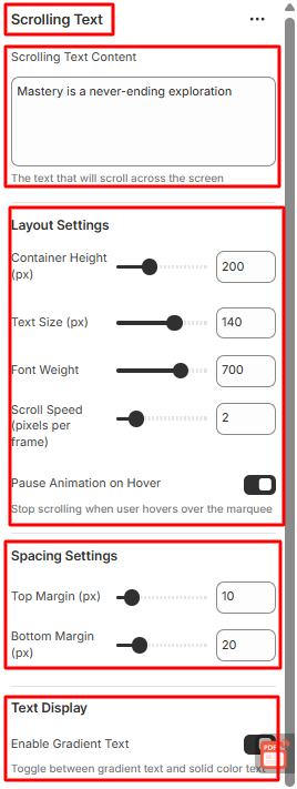
- Select and write the content on the scrolling text content.
- Then set the layout settings from container height to scroll speed. You can enable or disable the pause animation on hover.
- Need to set up the spacing, too, from the top to the bottom margin.
- If any gradient is needed in text, then you can enable or disable the test display button.
- Save
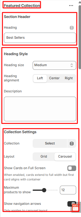
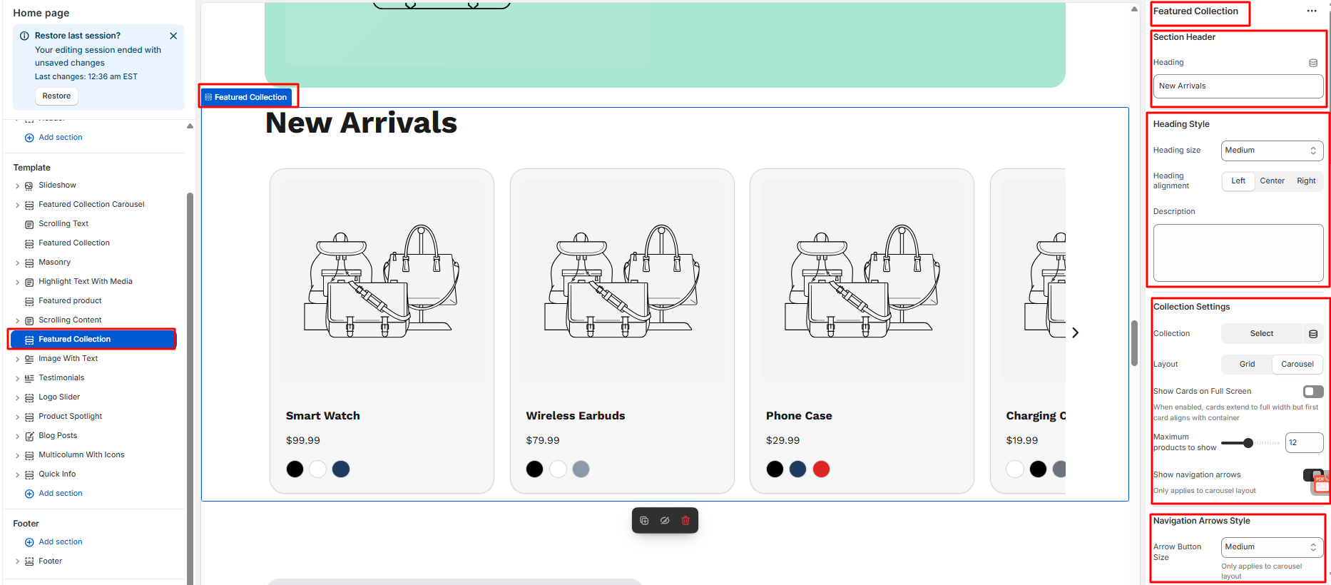
2.4 Featured Collections
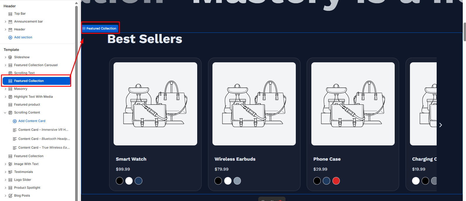
How to configure Featured Collection
- Write the heading from the section header on the right side of the theme editor.
- Then select and align the heading from the heading style.
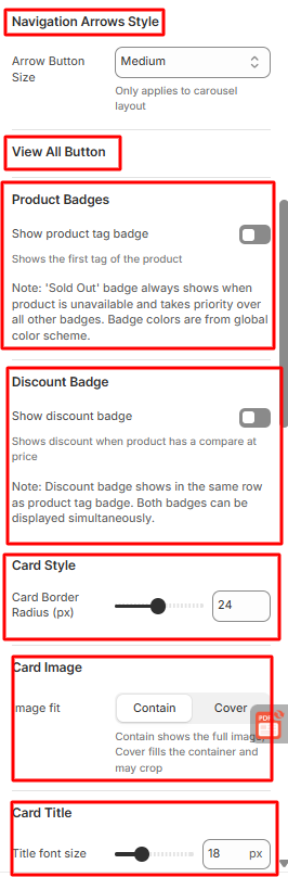
- Then set the collection settings, starting from selecting the collection to show the navigation arrow, which you can enable or disable.
- You can even select the navigation arrows style.
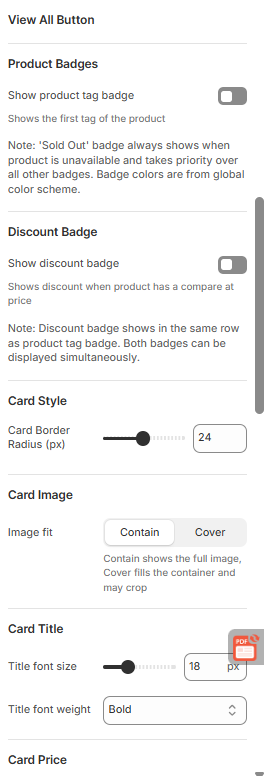
- To view all the buttons and make them enable or disable them, you can select the product and discount badge
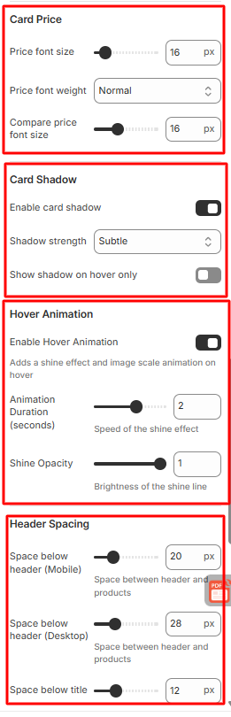
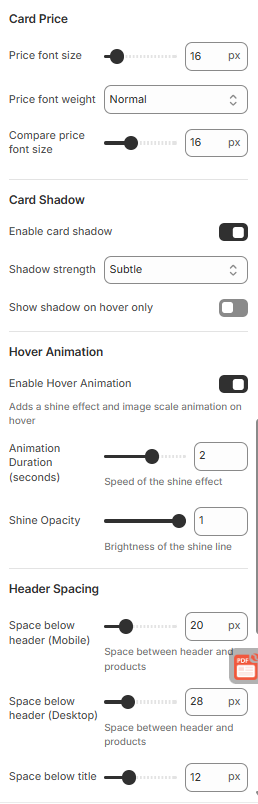
- Moreover, you can change the card style, image, title, Price, and shadow also.
- You can enable or disable the hover animation also.
- You can set the header spacing too, with the necessary settings for Desktop and mobile.
- The user can also set the section spacing from there.
- Save
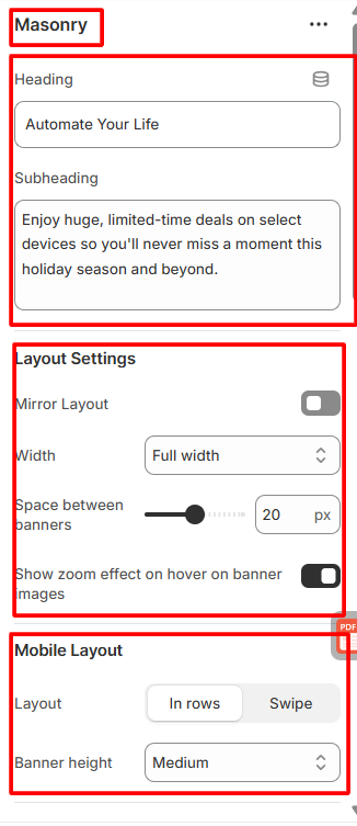
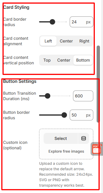
2.5 Masonry
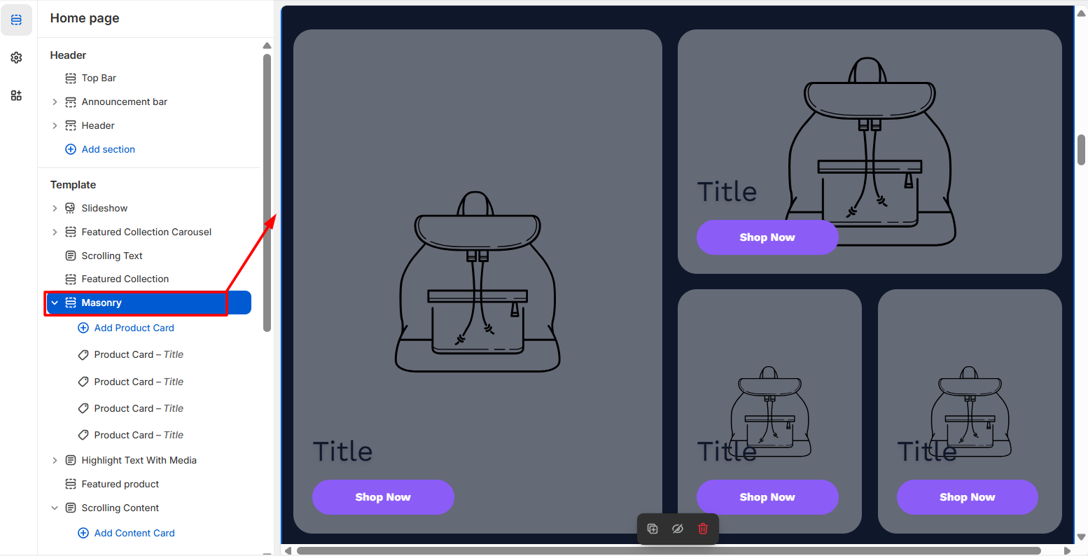
How to configure Masonry
- On the left side of the theme editor, find the template section, there click on Masonry.
- Write the heading with sub sub-subheading section.
- Then the user can set the layout with necessary customization.
- Moreover, users can customize the mobile layout, card styling, along button settings.
- Here user also sets the spacing
- Save
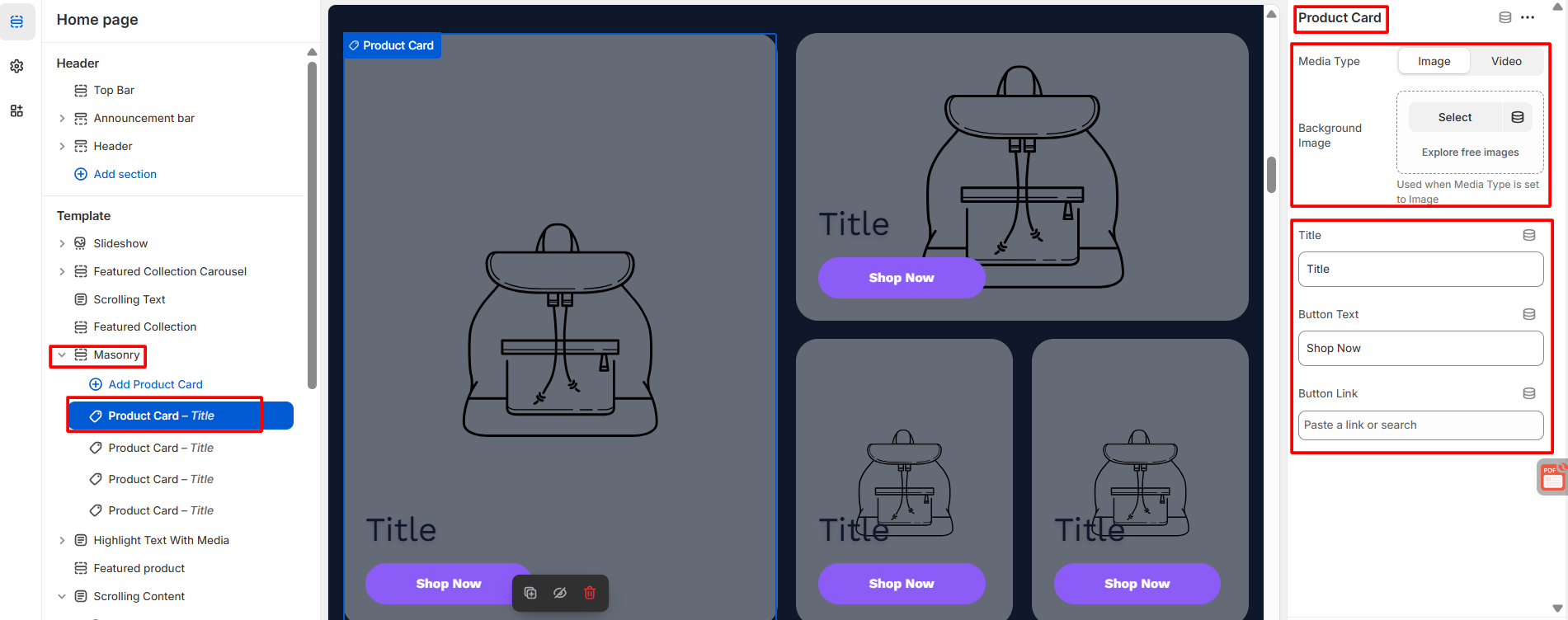
How to configure the product cart in Masonry
Steps:
- To add the product card in masonry, users need to click on the add product card.
- Then, from the right side user needs to configure with the necessary details.
- Save
2.6 Highlight text with media
- Click on the highlighted text with media in the theme editor
- Then, do the following needful configuration
- Save
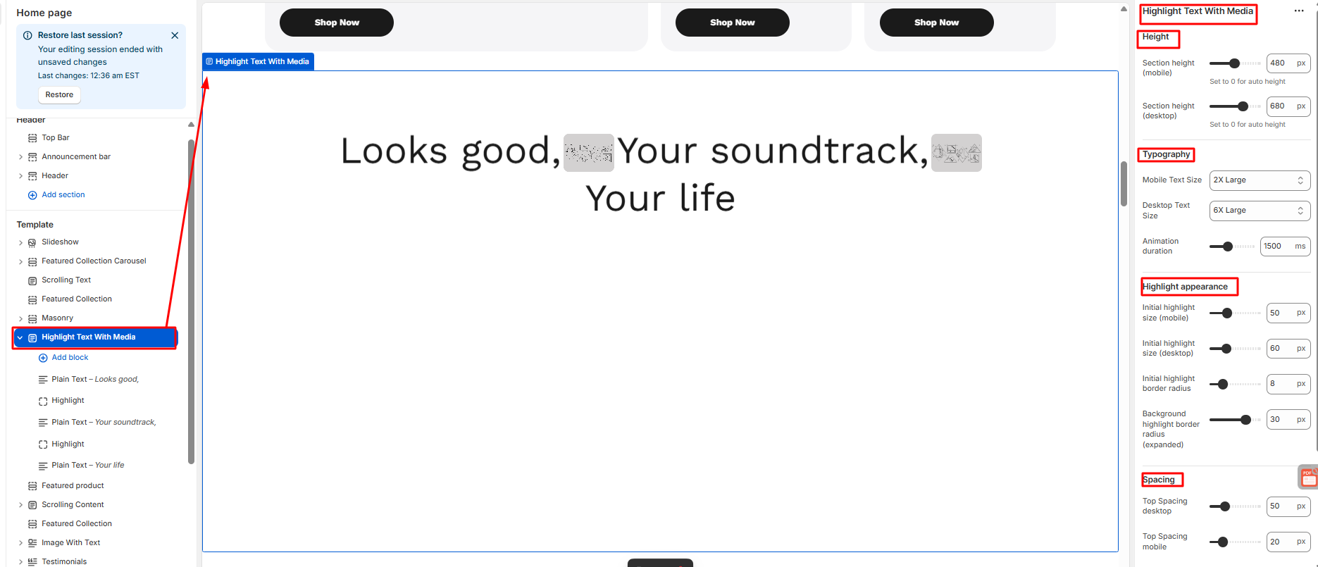
How to configure Highlight text with media
- In here, by adding a block, users can add any section they want to add.
- Users need to configure the section from plain text to highlight.
- Users can add images and videos from the right side of the theme editor
- Save
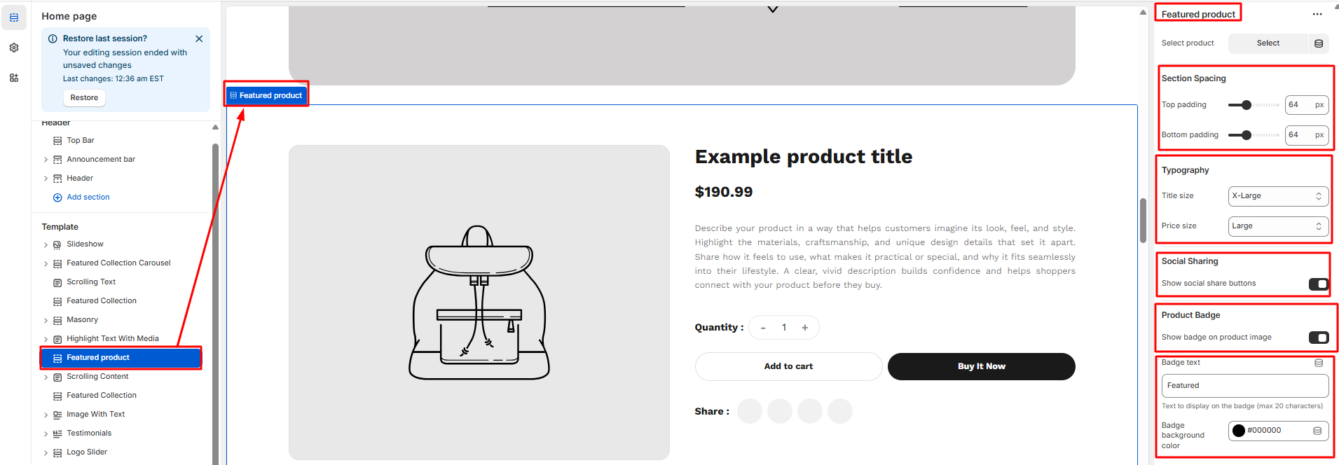
2.7 Featured Products
The Featured Product section is a built-in theme block that highlights a single product prominently on the homepage.
How to configure Featured Product
- On the left side of the theme editor, find the template section, there click on Featured Product.
- Then the user can set the layout with necessary customization.
- From the right side of the theme editor, select the product first
- Then the user needs to configure the section spacing and Typography
- The user can enable and disable the social sharing and product badge button
- The user can add badge text and color, too
- Save
2.8 Scrolling Content
- Click on the scrolling content in the theme editor section on the left side.
- Then, do the following needful configuration.
- Users can change section colors to section spacing from the scrolling content configuration section.
- Save
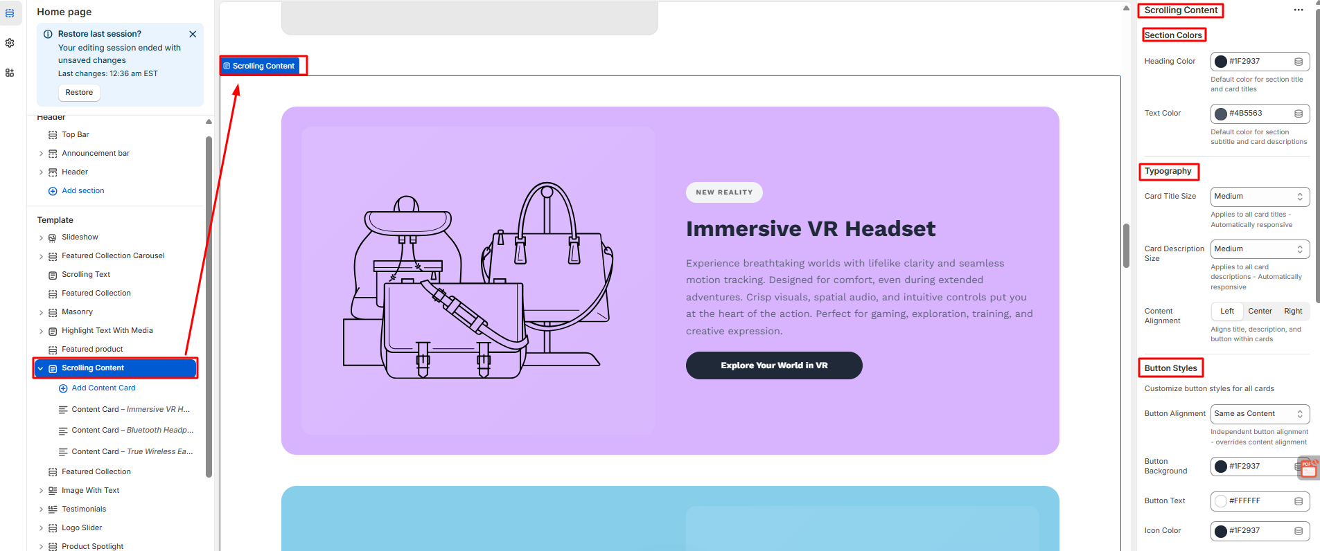
How to Scrolling Content
- Here, users can add as many content cards as they want.
- Users need to configure every card individually.
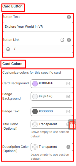
- The user can configure each and every content card with a card image, content, a button, and card colors.
- Save
2.9 Featured Collections
Featured Collection tabs refer to interactive sections that let customers browse multiple product collections within the same page, usually on the homepage, collection page, or a featured products section.
How to Feature Collection
Steps:
- Click on the featured collection in the theme editor section on the left side.
- Then, do the following needful configuration.
- From the selection header to the section spacing, users can configure every specification.
- Save

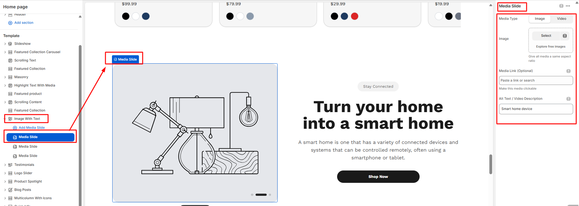
2.10 Image with Text
- Click on the image with text in the theme editor section on the left side
- Then, do the following needful configuration.
- Starting from image layout settings, Dot indicator settings, to spacing settings, users can configure each section
- Save
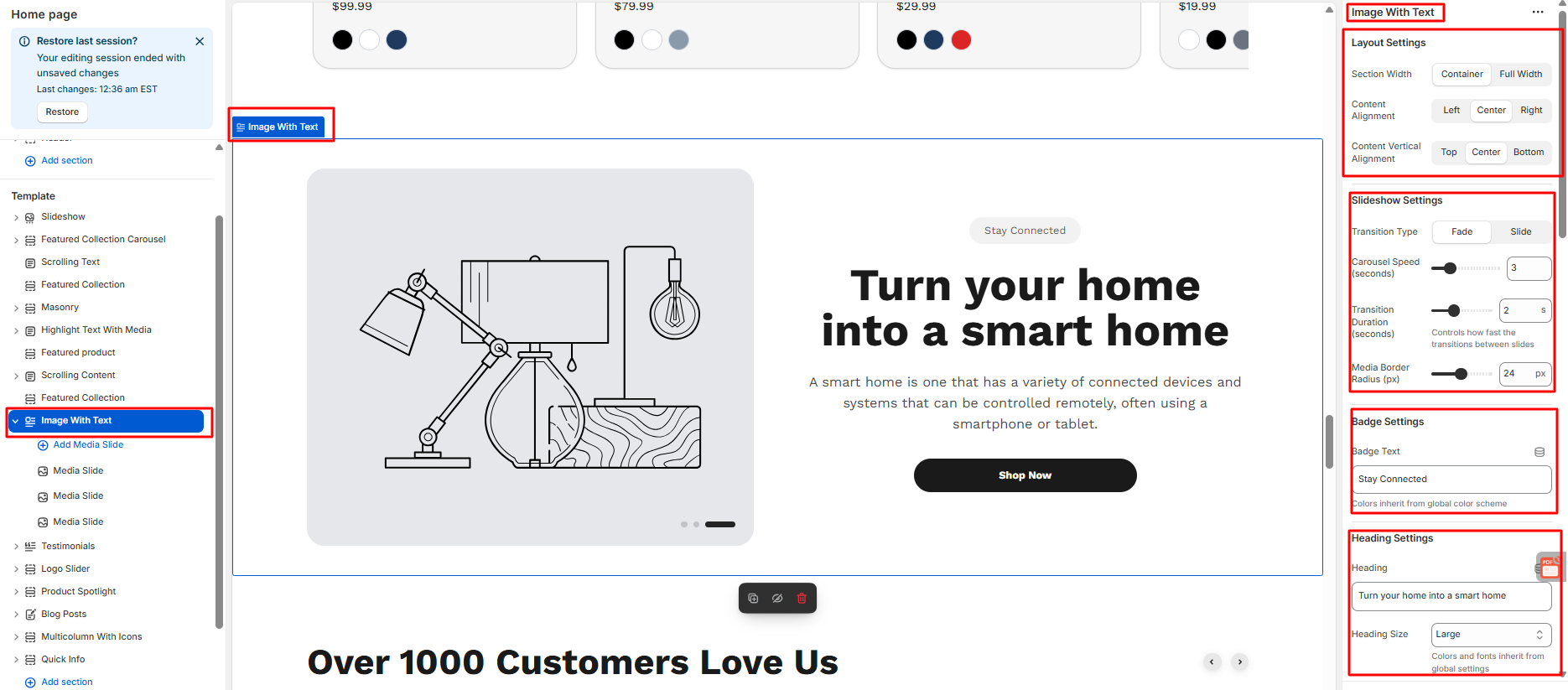
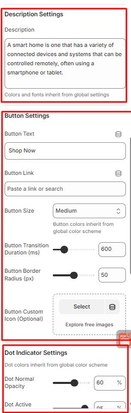
How to Configure an Image with Text
- Users can add as many Media Slides as they want
- Every media slide can be individually configured
- Users can choose the media type they want to use for their image or video.
- Users can add media links and give video descriptions, too.
- Save
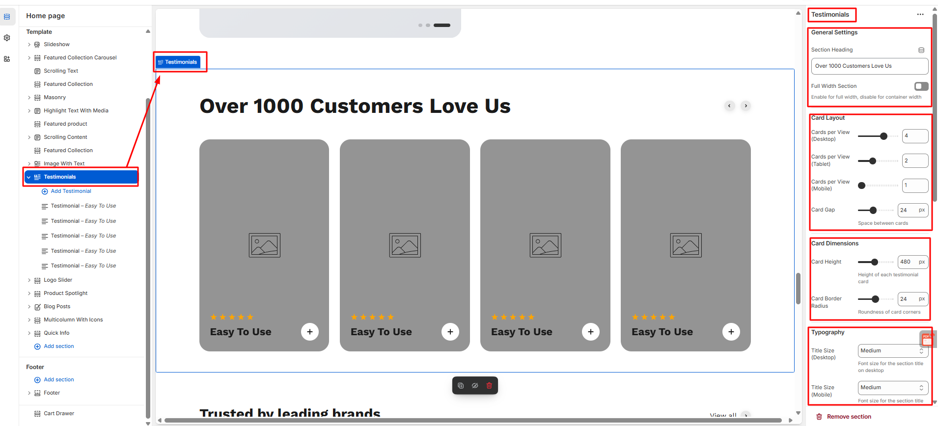
2.11 Testimonial
Steps:
- Click on the testimonial in the theme editor section on the left side
- Then, do the following needful configuration.
- Starting from general settings, card layout, card dimensions, typography, hover effects, auto slide to spacing, users can configure each section
- Save
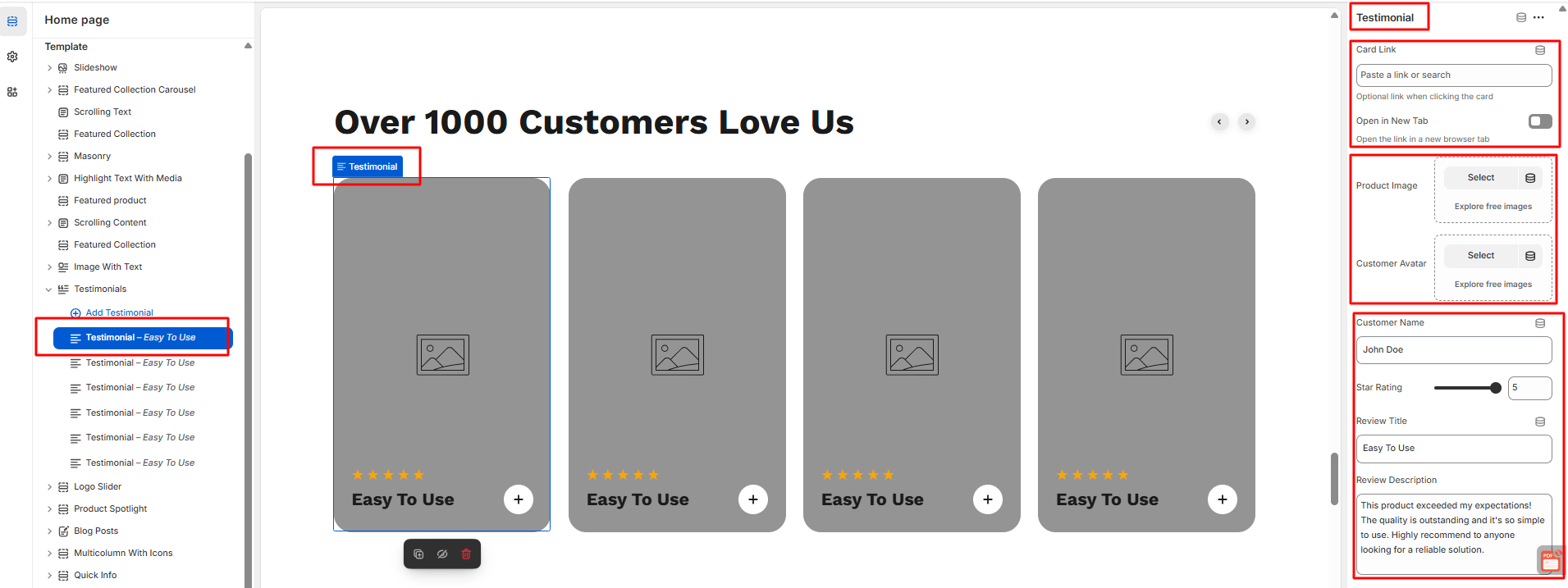
How to Configure Testimonial
- Users can add as many testimonial as they want./li>
- Every media slide can be individually configured.
- From the right side user can add card link.
- User can open this testimonial in new tab anytime can enable and disable it. Can add product image and customer avatar.
- User can add customer name can give star rating can give review title with description .
- Save
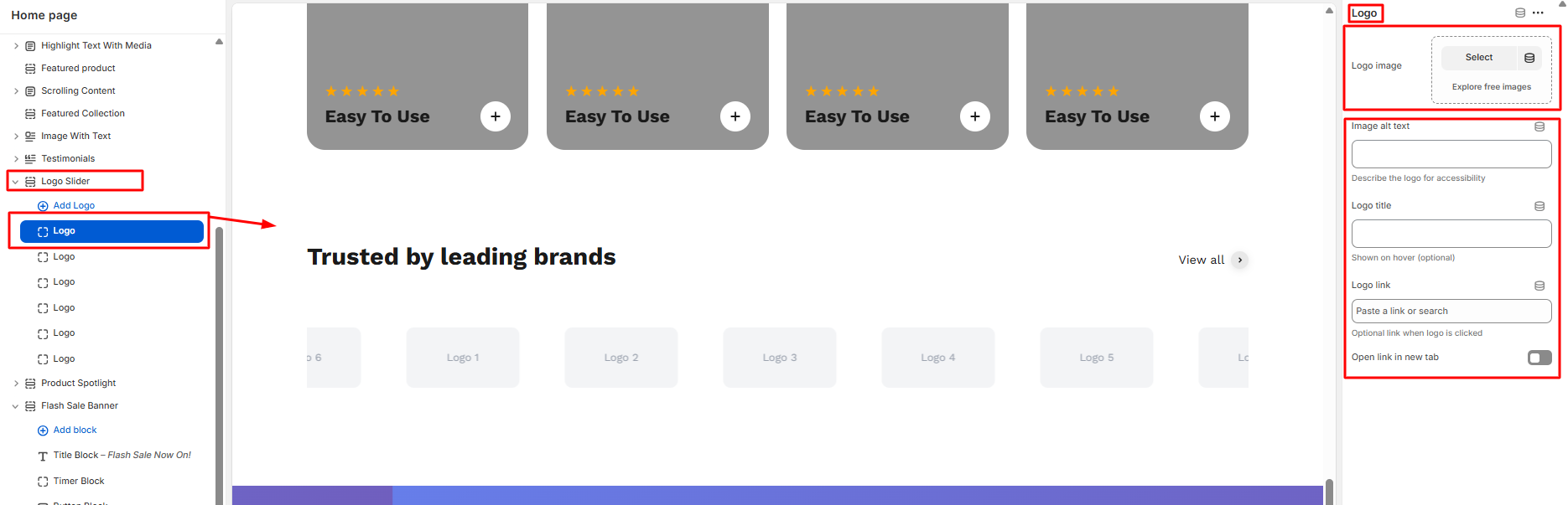
2.12 Logo Slider
- Click on the logo slider in the theme editor section on the left side
- Then, do the following needful configuration.
- Starting from section header , logo settings, Animation settings, sadow to layout settings.
- Save
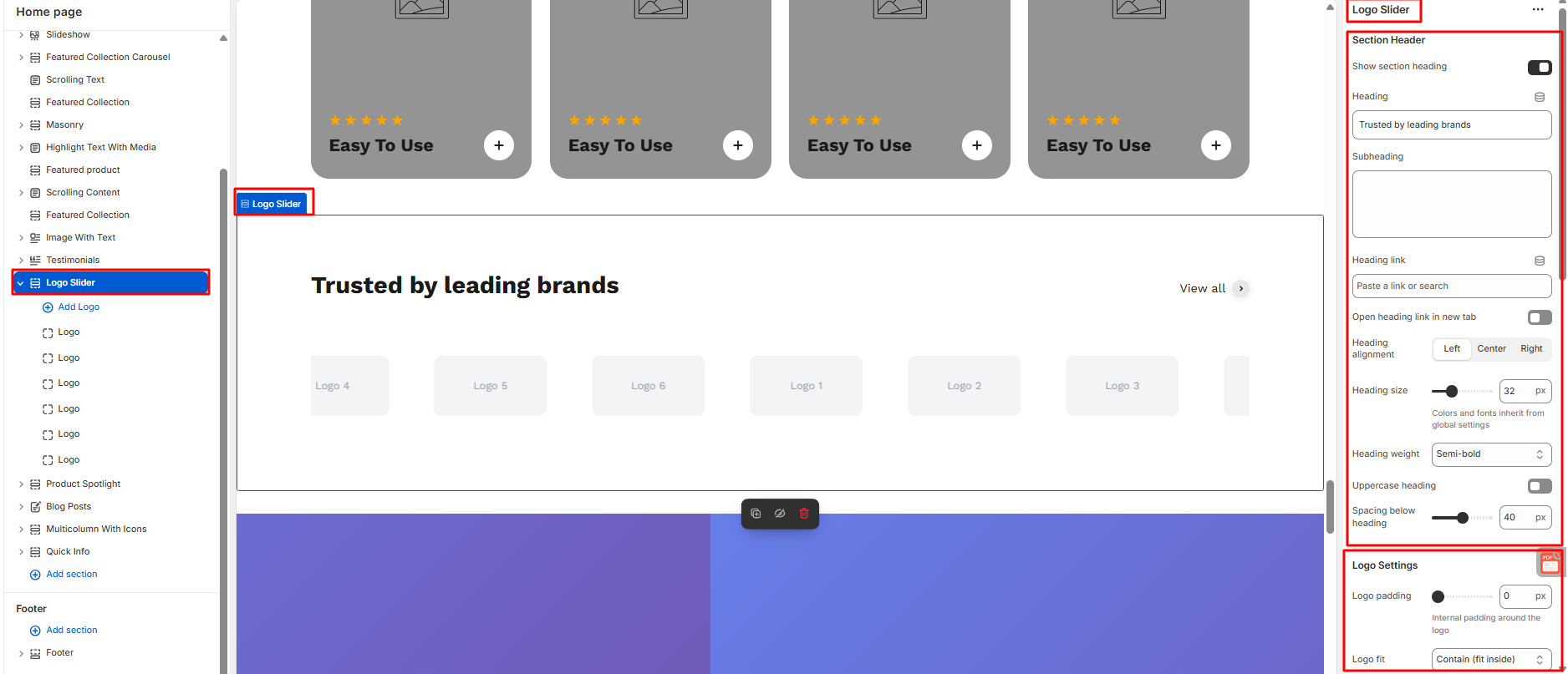
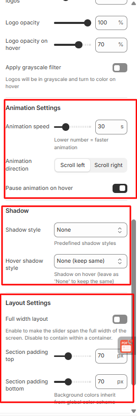
How to Configure Logo Slider
- Users can add as many logo as they want.
- Every logo slide can be individually configured.
- User can add logo image , image alt text
- User can add logo title and logo link here.
- User can enable or disable the button of open link in new tab
- Save
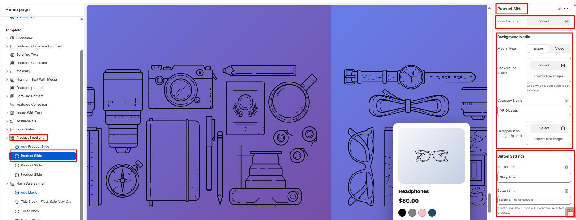
2.13 Product Spotlight
- Click on the product spotlight in the theme editor section on the left side.
- Then, do the following needful configuration.
- Starting from Product Spotlight, Progress bar, Navigation,Product Card, Shop Button to spacing.
- Save
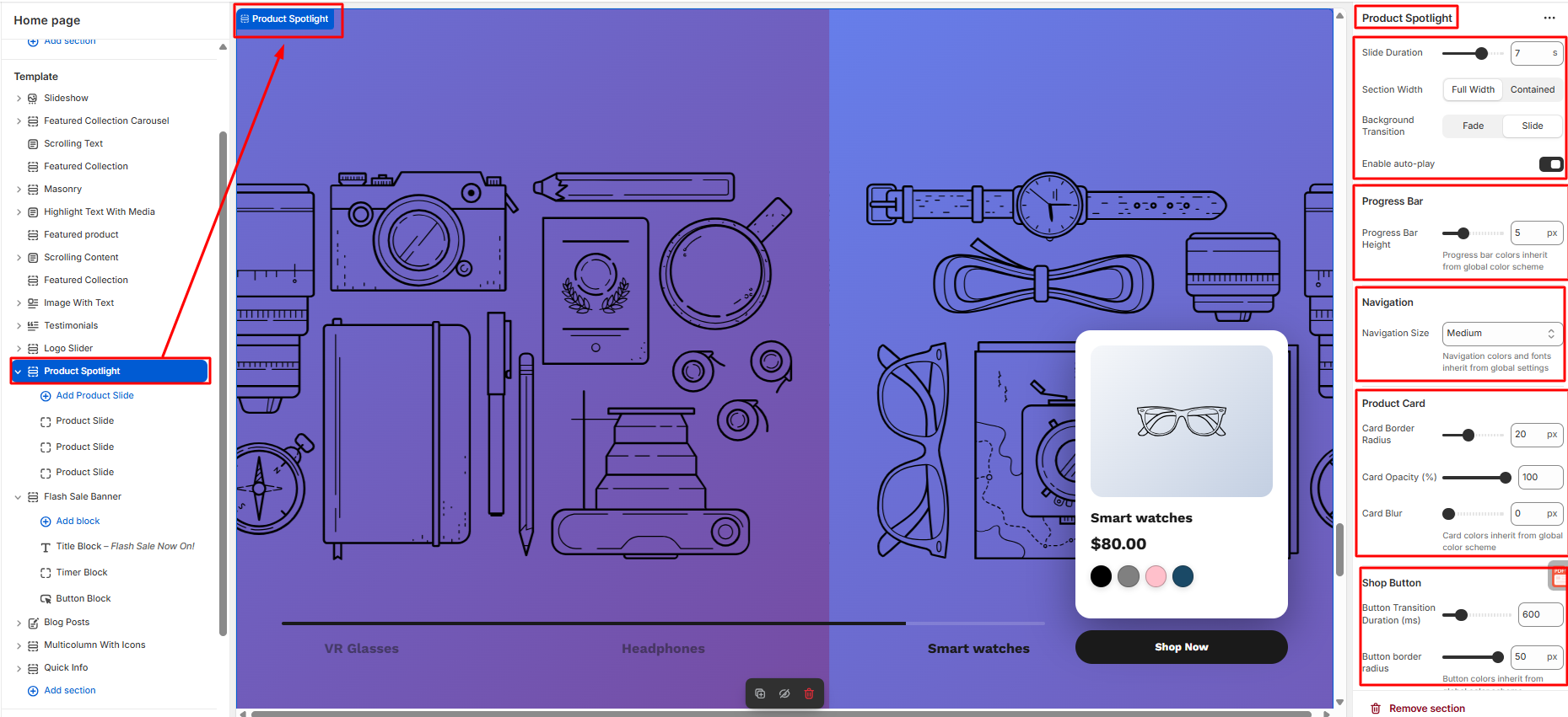
How to Configure Product Spotlight
- Users can add as many product spotlight as they want.
- User can add product slide, Background media and can configure button settings too.
- Save
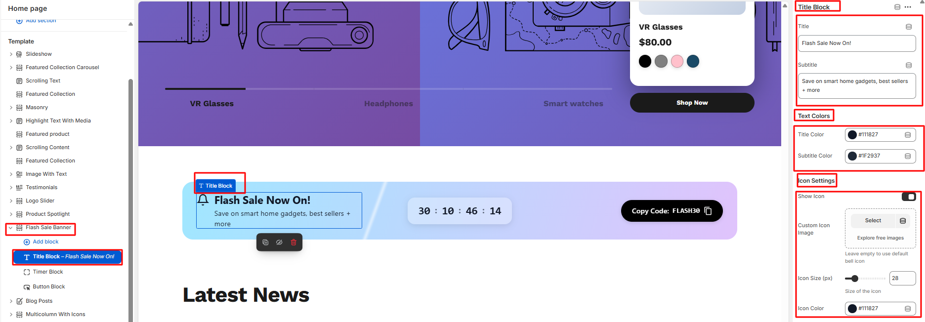
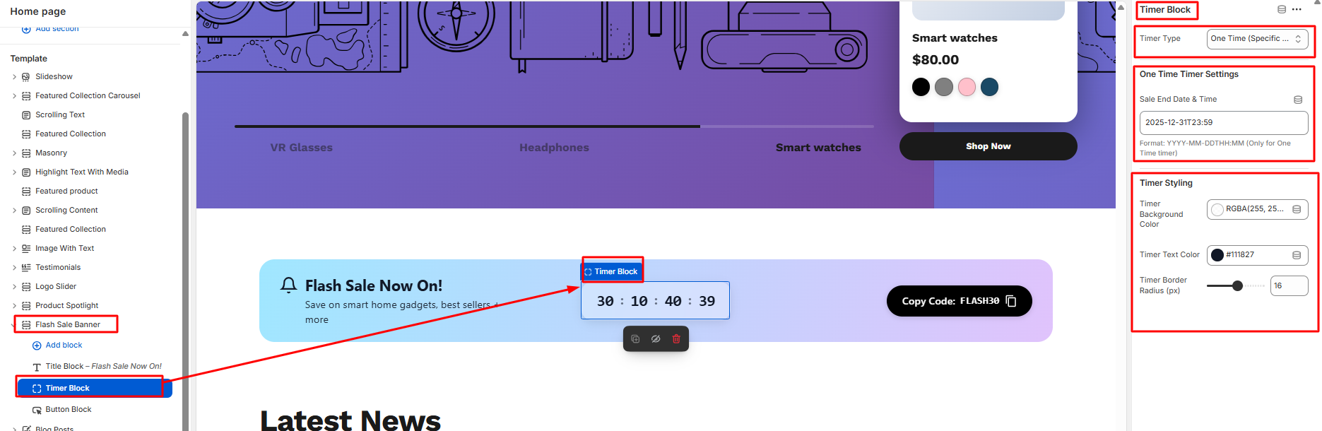
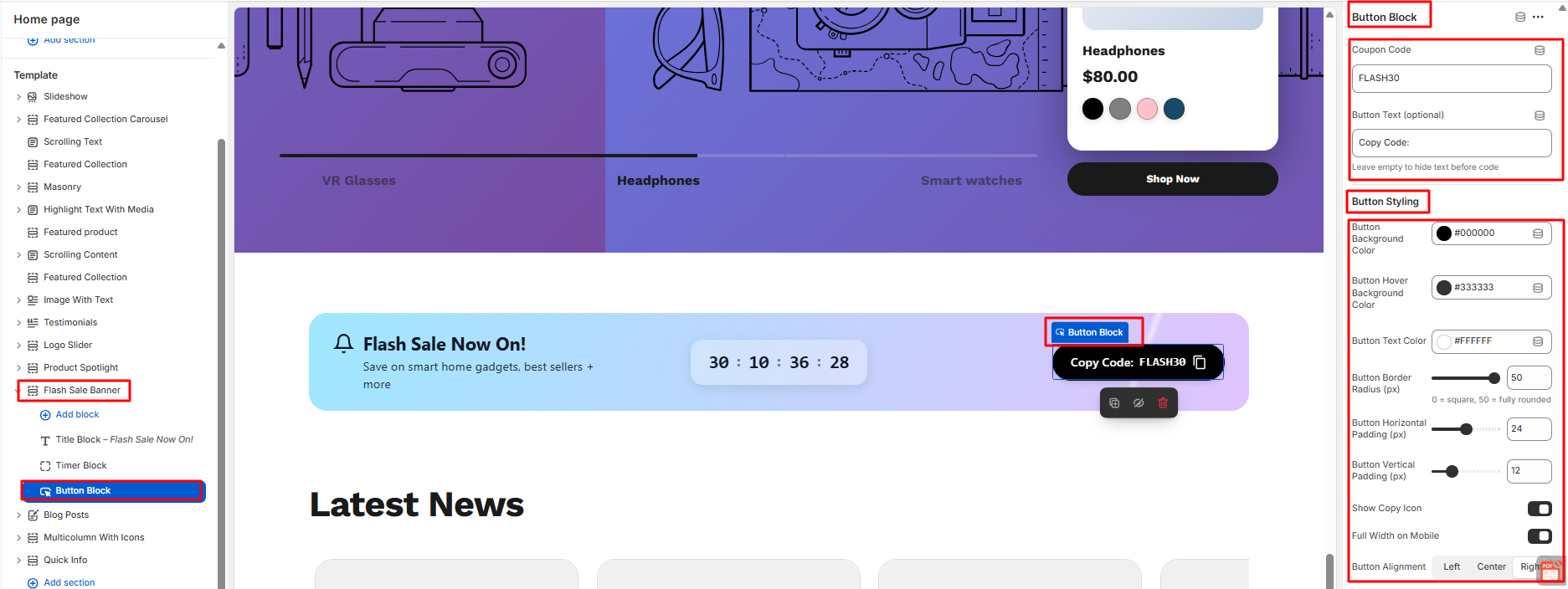
2.14 Flash Sale Now On
- Click on the flash sale now on in the theme editor section on the left side.
- Then, do the following needful configuration.
- Starting from background settings , animation settings, banner inner spacing to section spacing.
- Save
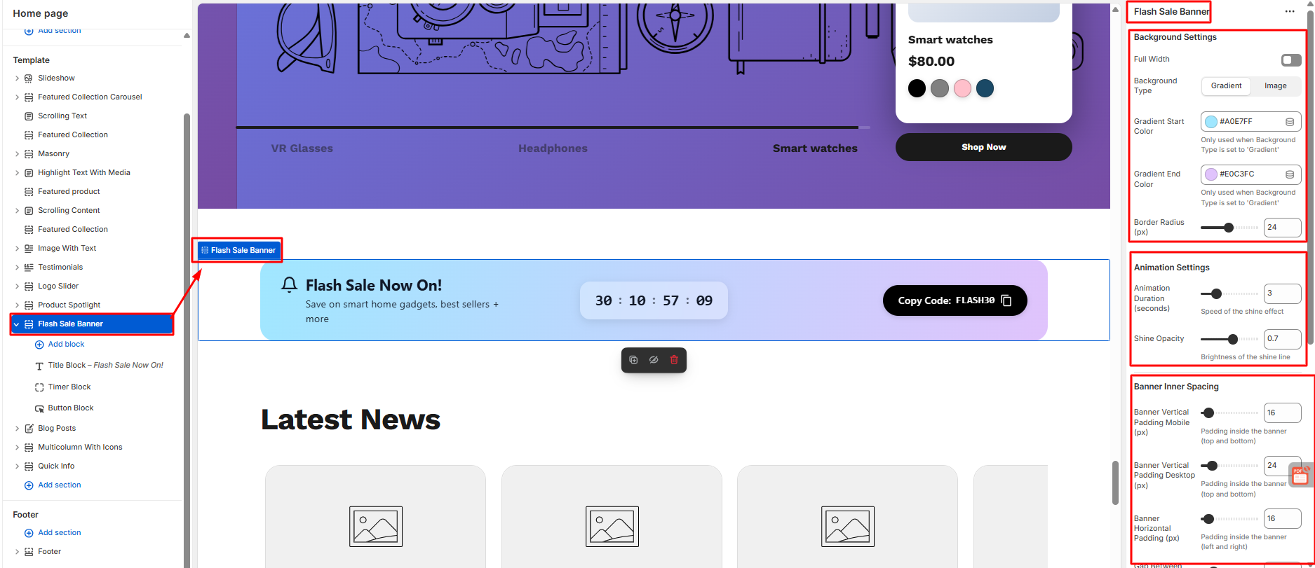
How to Configure Flash Sale Now On
- User can add title block from the right side of the theme editor.
- User can add title,subtitle,text colors and icon settings.
3. User can give timer type , can set one time timer settings, can also add timer styling.
4. User can configure from button block to button styling
2.15 Blog Post
- Click on the blog post in the theme editor section on the left side.
- Then, do the following needful configuration.
- Starting from section settings, card design, card border, card hoover effect, arrow border to section spacing.
- Save
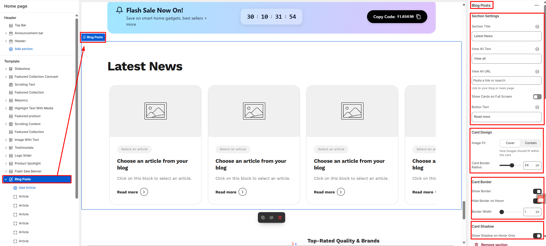
How to Configure Article
- Users can add as much as Article as they want.
- Users can set the article from the right side.
- Save
2.16 Multicolumn with Icon
How to configure Multicolumn with Icon
- Click on the Multicolumn with icon in the theme editor section on the left side.
- Then, do the following modifications on the multicolumn with icon..
- Starting from layout, container, title, subtitle, and button settings, Feature item design, feature text styles and space settings
- Lastly they can change the global color scheme inside theme settings.
- Save
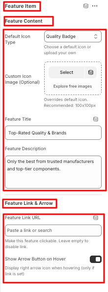
How to configure Feature Item
- Users can add as many Feature item blocks as they want under the multicolumn with icon section
- Click on the feature item block under the multicolumn with icon section on the left side panel.
- The configuration settings are on the right side of the editor.
- Users can customize feature content and feature link & arrow.
- Save
2.17 Quick Info
- Click on the Quick Info under templates in the theme editor section on the left side.
- Then, do the following modifications on the multicolumn with icon..
- Then, do the following needful configuration.
- Starting from general settings, divider settings, spacing, bottom line bar, spacing settings, and theme settings.
- Save
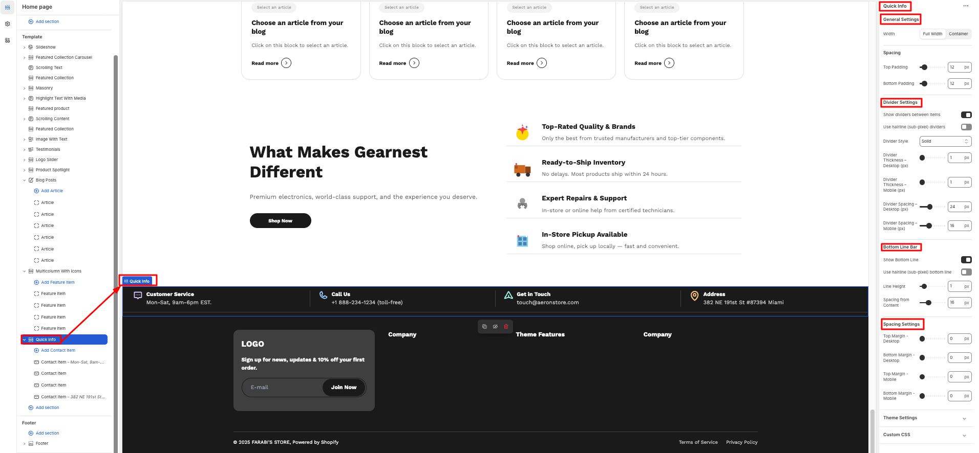
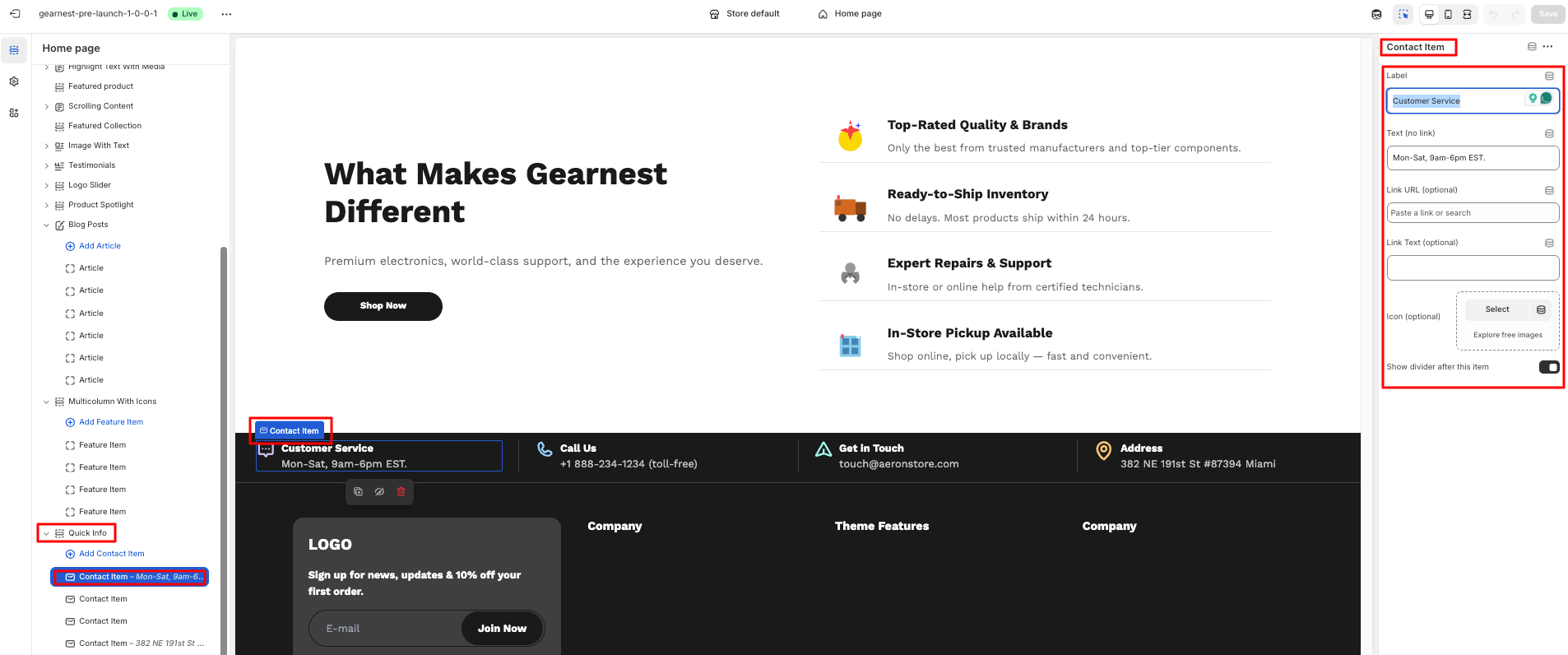
How to Configure Contact Item
- Users can contact item blocks according to their wish.
- Users can change the contact item starting from label, text, link URL, link text , upload icon, and show divider on the right side panel.
- Save
3. Product Page
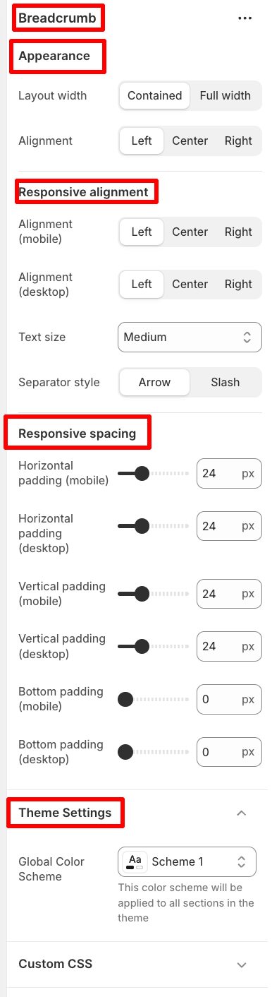
3.1 Breadcrumb
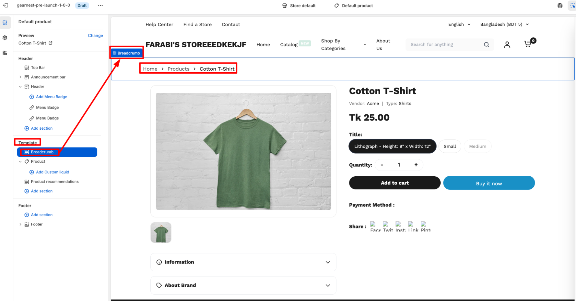
How to add Breadcrumbs
- On the left side of the theme editor, find the template section, there click on breadcrumbs to add it.
- On the right side panel, configure the breadcrumb by modifying the appearance, responsive alignment, and spacing along with theme settings.
- Save
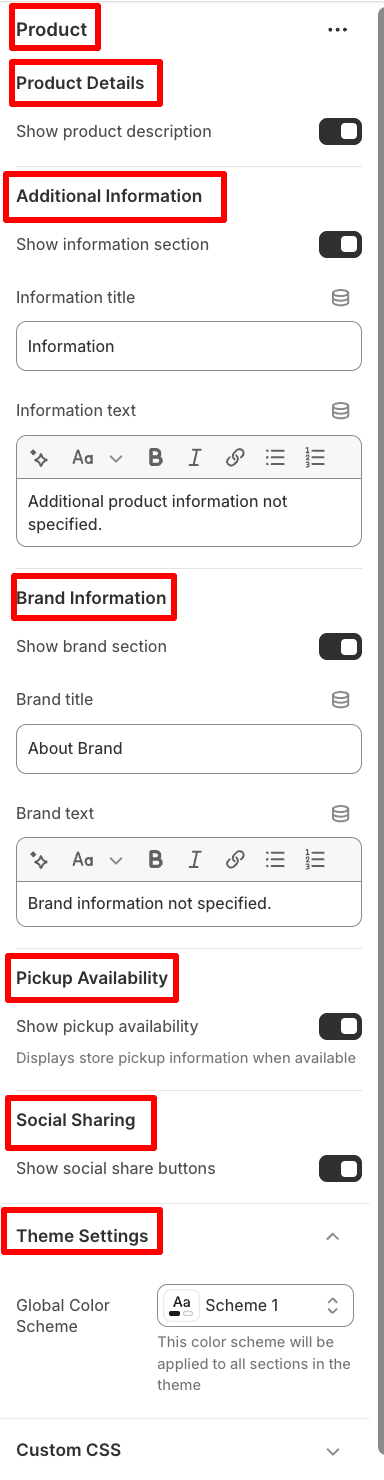
3.2 Product
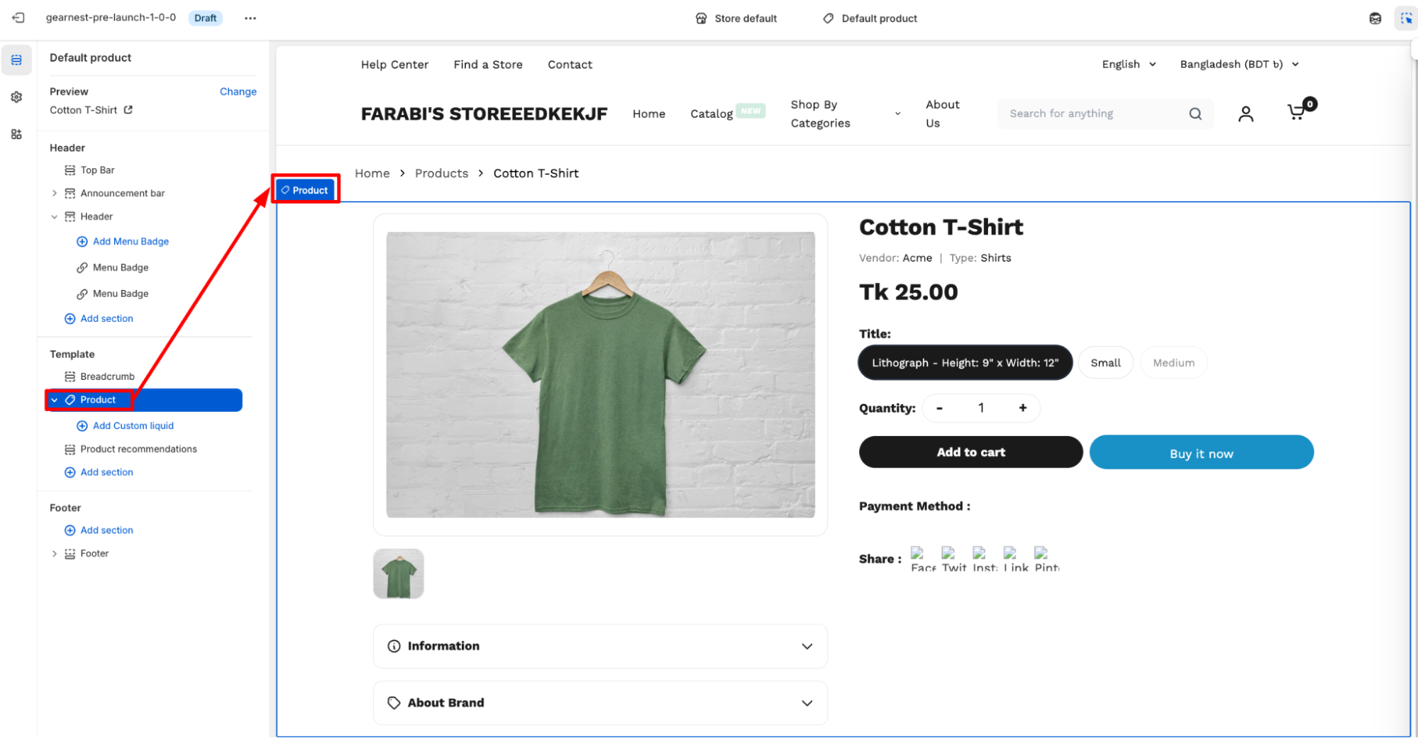
How to add Product
- Go to the template section on the left side panel of the editor click on the product section.
- Configure the necessary changes on product details. Users can also add additional information along with brand information.
- Users can enable pickup availability and social sharing.
- Lastly, they can change the global color scheme in theme settings.
- Save
3.3 Recommended Products
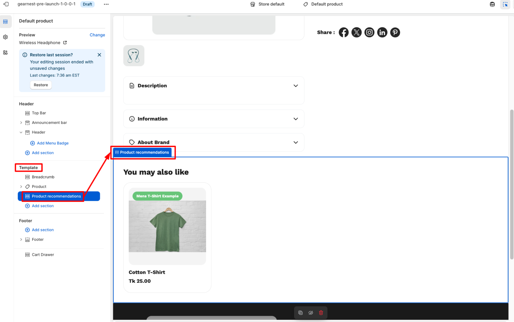
How to add a product recommendation
- Go to the template section on the left side panel of the editor click on the product recommendations section.
- Configure the necessary changes on the right side panel.
- Users can add heading text and modify the no of products to show and the columns to be displayed on desktop.
- They can also modify the recommendation type to related or complementary.
- Users can change badge settings.
- Lastly, they can change the global color scheme in theme settings.
- Save
4. Collection Page
4.1 Collection
- Go to the template section on the left side panel of the editor click on the Collection section.
- Configure the necessary changes on the right side panel.
- Save
5. Collection List Page
5.1 Collection Grid
How to configure a Collection Grid on the editor
- Go to the template section on the left-hand panel of the editor, then click the collection grid.
- Configure the necessary changes on the right side panel.
- Users can determine the grid item width on Mobile between small and large
- The image ratio can be chosen from variations
- Users can choose the grid spacing and items per page to be displayed
- Lastly, they can change the global color scheme in theme settings.
6. Gift Card Page
A Gift Card Page in Shopify is the dedicated page where a customer can view, download, print, or redeem a gift card after purchasing it. Shopify automatically generates this page with the gift card’s unique code, QR code, balance, and expiry details.
7. Cart Page
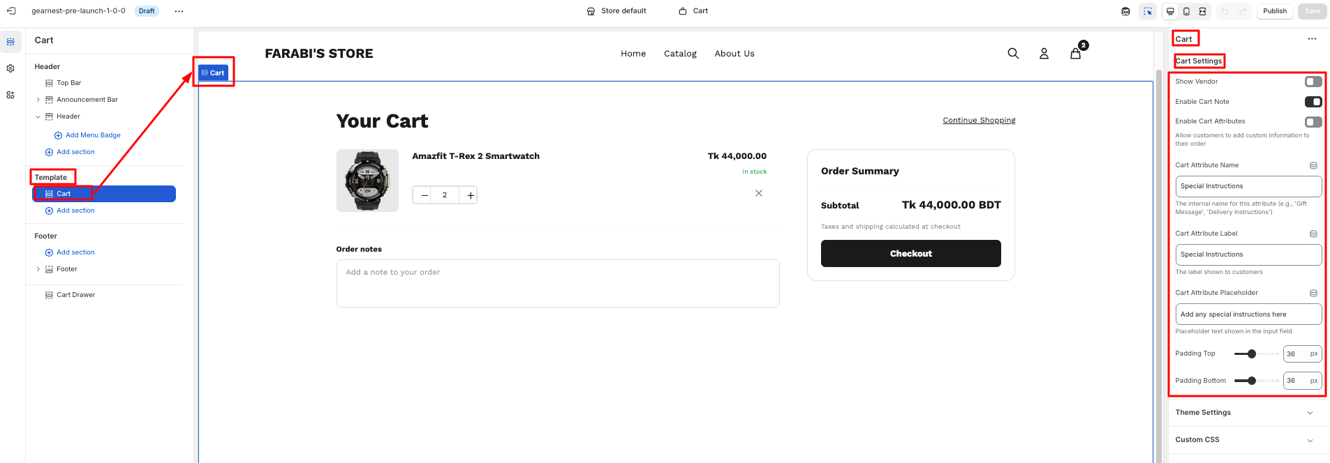
How to configure Cart
- Go to cart section under template on the left side panel of the editor.
- Click on the cart and a right side panel opens up for configuration.
- Configure the necessary changes on the right side panel.
- Users can modify cart settings starting from enabling/disabling vendor,cart note,cart attribute display.
- They can also chage the cart attribute name,label and placeholder.
- Lastly user can change the top and bottom padding.
- Save
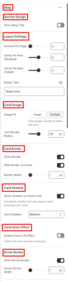
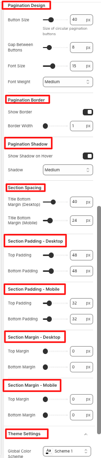
8. Blog Page
8.1 Blog
How to add a Blog to your Shopify store
- Go to the template section on the left-hand panel of the editor, then click the blog section.
- Configure the necessary changes on the right side panel.
- Users can show the blog title and change layout settings as to how many articles will be shown per page, to cards to be shown per row.
- Button text can be modified.
- Users can change the card design, border, and shadow, and enable the card hover effect and arrow border as well.
- The pagination design, border, and shadow can be configured by users.
- Users can modify the section spacing, padding, and margin for both desktop and mobile.
- Lastly, they can change the global color scheme in theme settings.
- Save
8.2 Product Spotlight
Refer to the Product Spotlight section.
8.3 Featured Collection
9. Article Page
9.1 Article
How to add an Article to your Shopify store
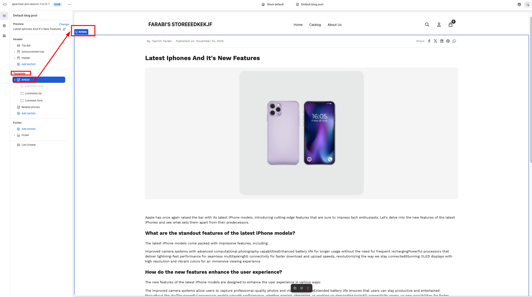
- Go to the template section on the left side panel of the editor click on the article section
- Configure the necessary changes on the Shopify admin by navigating to Content>Blog Posts.
- Add a comment list and a comment form.
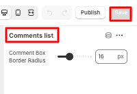
How to add a comment list block
- Go to the template section on the left side panel of the editor, click on the comment list block under the article section.
- Configure the comment box border radius.
- Save
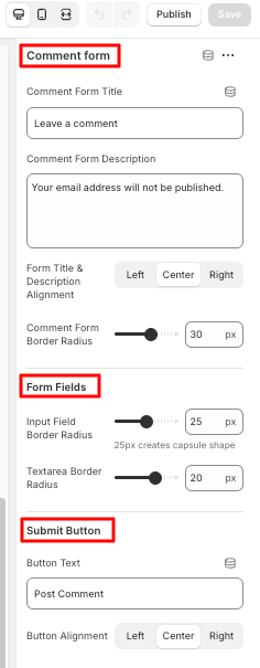
How to add a comment form block
- Go to the template section on the left side panel of the editor, and click on the comment form block under the article section.
- Edit the comment form title and its alignment, along with the description. Change the dorm fields from input field border radius to text area border radius. Then edit the submit button text and alignment.
- Save
10. Search Page
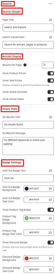
10.1 Search
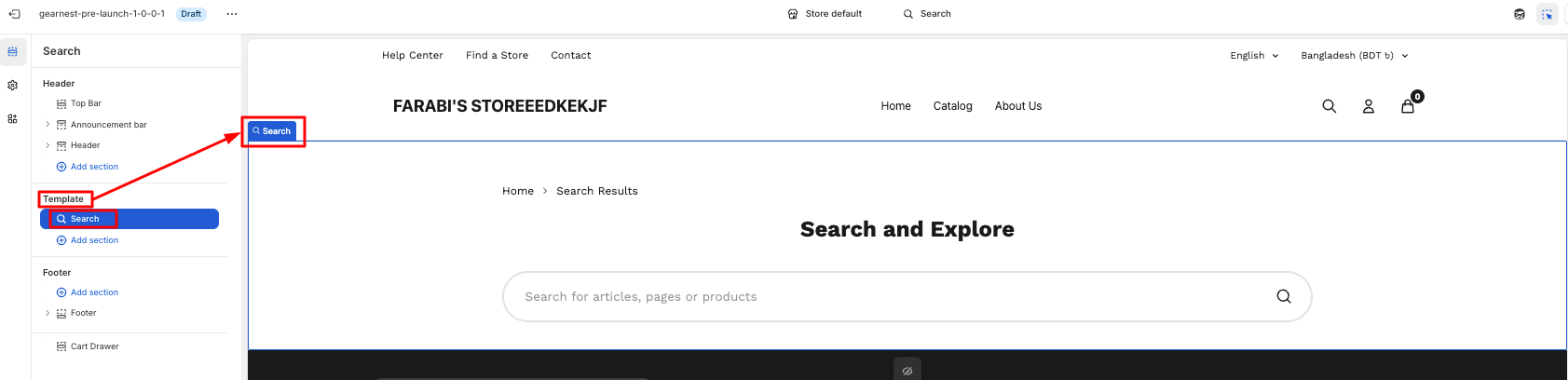
How to configure Search
- First, navigate to the template section on the left side panel of the editor, and click on the search section.
- Edit the search header from the page title to the search
- In the results display section, fix the no of results per page and enable/disable to show Product Prices, Sale Prices, Article Excerpts, Article Dates.s
- In the empty state, put the no results title and message.
- In case of badge settings, users can modify the sold put badge text, text color, and background. They can also change the text color and background color of the product tag badge and discount badge after enabling those.
- They can change the global color scheme in theme settings.
- Save
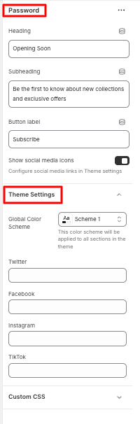
11. Password Page
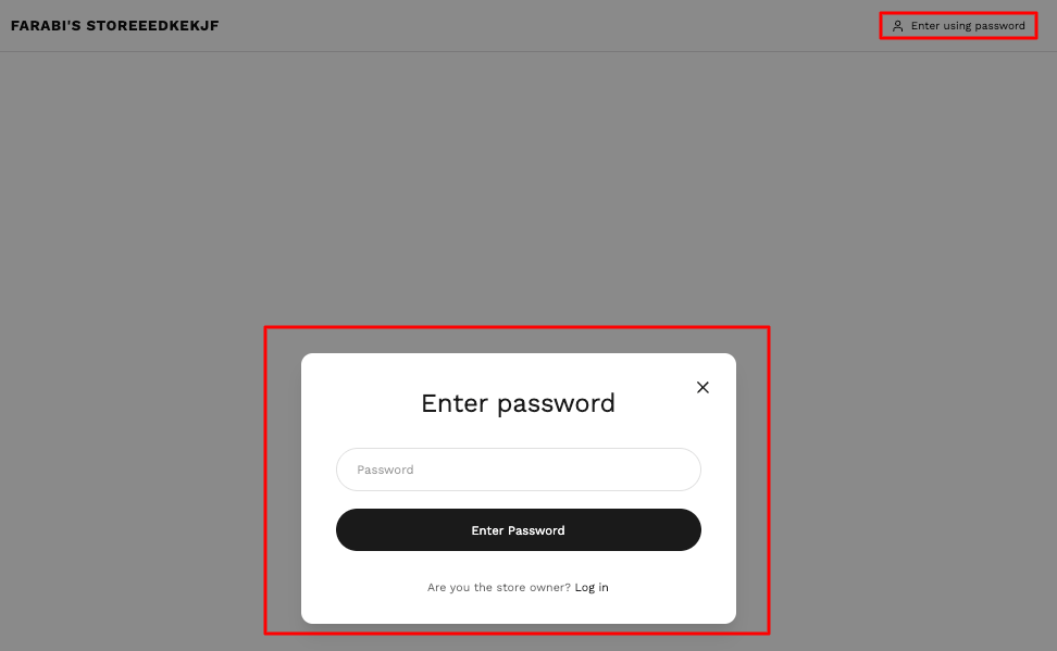
11.1 Password
How to add a Password section to your Shopify theme
- Navigate to templates from the left panel and click on the Password Section.
- In the Configuration, the user can edit the heading and subheading text. The button label can be customized as well.
- Users can either enable or disable the social media icon display
- They can change the global color scheme in theme settings.
- Save
12. 404 Page
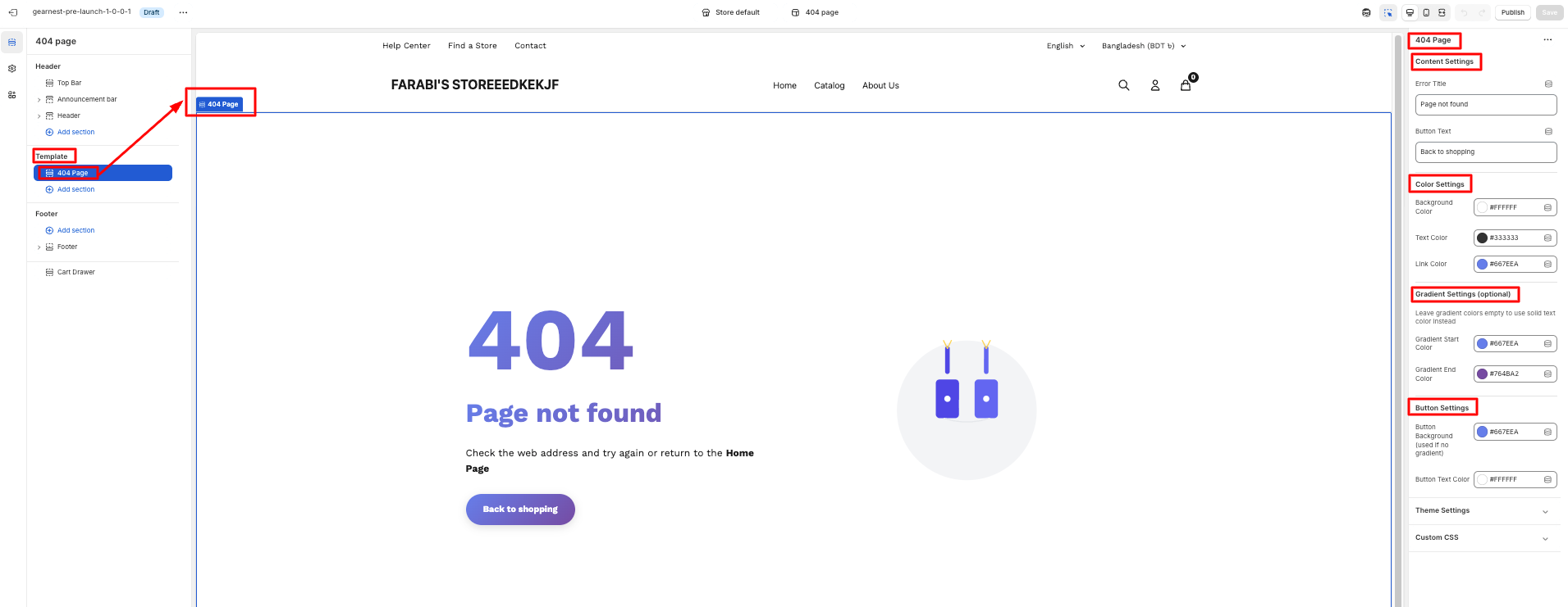
12.1 404 Page
How to add a 404 Page
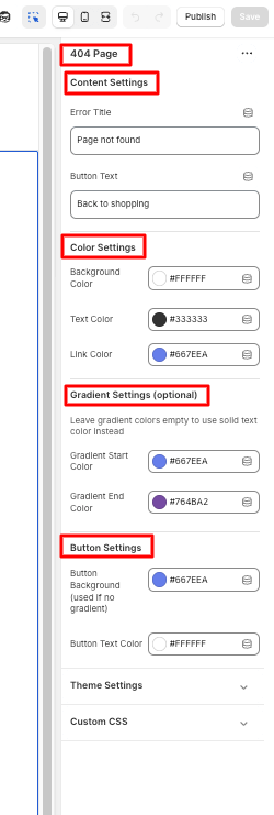
- Navigate to templates from the left panel and click on the 404 page section.
- Configure the changes in content settings by editing the error title and button text.
- Adjust color settings but changing the color of the background, text, and link.
- Customize the gradient settings (from gradient start to end ) and button settings by changing the button background and text color. .
- Lastly, users can change the global color scheme in theme settings.
- Save
13. About Us Page
13.1 Hero Banner
How to add Hero Banner
Steps:
- Go to the template section and click on add section to find the hero banner, then add it
- Configure the hero banner by putting a background image, heading, subheading, and changing text alignment
- Next, change the layout from content width to desktop height, enable/disable overlay, and change its color and opacity
- Enable;e/disable button and its text and its color, background color, and link, along with button border radius and color
- Users can adjust the icon circle background, color Lastly, users can change the global color scheme in theme settings.
- The transition duration can be set
- Save
13.2 Masonry
Refer to the Masonry section.
13.4 Testimonials
Refer to the Testimonials section.
14. Terms and Conditions Page
14.1 Terms & Policies
How to add the terms & policies section
- Go to templates from the left panel and click on the add section, then choose the terms & policies section.
- Configure the changes in the color scheme.
- Enable or disable breadcrumbs display
- Edit the text in the heading and description
- Modify the section top and bottom padding
- Save
15. Contact Page
15.1 Breadcrumb
Refer to the Breadcrumb section.
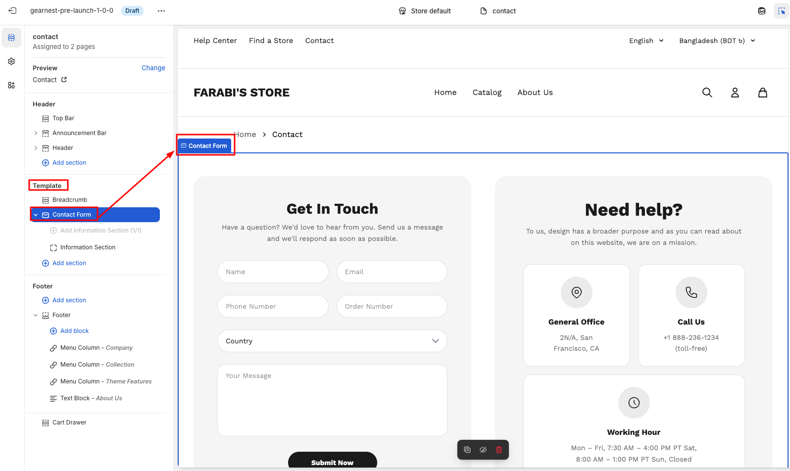
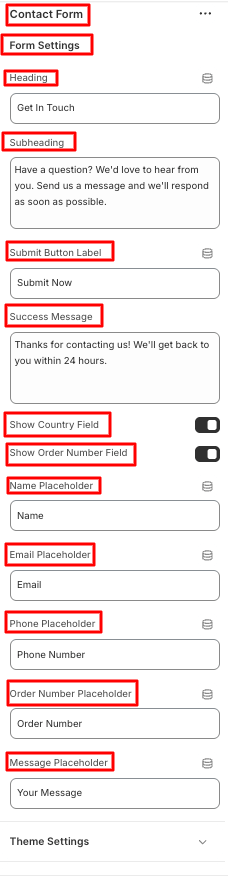
15.2 Contact Form
How to configure the contact form section
- Navigate to templates from the left panel and click on the contact section
- To configure it, go to the right panel of the editor
- Customize the text of the submit button
- Enable/disable the country and order number field
- Adjust the text inside name, email,phone, order number, message placeholder \
- Modify the section top and bottom padding
- Lastly, change the global color scheme under theme settings
- Save
Install GearMart
A professional guide for installing the GearMart theme on your Shopify store.
Try the GearMart Theme from the Shopify Theme Store for Free
If you would like to explore the GearMart theme before making a purchase, Shopify allows you to try it with your store. This provides the opportunity to see how the theme looks and functions with your products and branding. Follow these steps:
Buy GearMart Theme from Shopify Theme Store
You can only publish themes to your online store after purchase. Once you purchase a theme from the Shopify Theme Store, it is licensed exclusively to the store where the purchase was made.
Step 1: In your Shopify admin, click Online Store > Themes..
Upload a Theme File from Your Computer
Important note: We strongly recommend purchasing and installing themes directly from the Shopify Theme Store for the best experience. This ensures you receive automatic updates, official support, and proper licensing. If you have a theme in a ZIP file on your computer, you can upload it to the Themes page in your admin. Before you upload, ensure that your theme files are compressed into a single ZIP file.
Update GearMart:
Update the Theme Automatically
1. Check Notifications on Shopify
In your Shopify admin, go to Online Store > Themes. If a new version of the GearMart theme is available, you’ll see a notification in your theme library.
2. Review Update Details
- Click the notification to view more details about the update.
- Select View release notes to read what’s new in the release.
3. Add to Theme Library
Click Add to theme library to download and add the updated version of GearMart to your Shopify store. The updated version will now appear in your theme library, ready to customize and publish.
Troubleshooting: No Update Notification?
If you don’t see an update notification, it could be due to code customizations conflicting with Shopify’s update system. In this case, you can manually reinstall the theme.
1. Reinstall the Theme
Download the latest version of the GearMart theme from the Shopify Theme Store and upload it to your store (instructions below).
2. Manually Transfer Customizations
Any custom code or third-party app snippets will need to be re-implemented in the new version.
Preparing for the Update: Create a Backup
Before updating your theme, always duplicate your current theme to create a backup. This ensures you can restore your store if something goes wrong.
Step 1:In your Shopify admin, go to Online Store > Themes..
Upload the Latest Theme Version
Once you’ve downloaded the updated GearMart theme from the Shopify Theme Store, upload it to your Shopify store.
Step 2: In the Theme library, select Add theme > Upload zip file.
Step 3: In the Upload theme modal, click Add file and select the file you want to upload.
Step 4: Click the Upload file.
Move the Theme Settings and Pages
After uploading the new theme, transfer your settings, custom templates, and modifications to the new version.
Step 1: Go to your current theme, click Actions > Edit code.
Step 2: Copy the following files from the old theme and paste them into the same folders in the new version:
- All edited JSON files in the Templates folder.
- The settings_data.json file is in the Config folder.
Step 3: Re-create custom templates (if any).
Re-install Apps
Any apps that add code to your theme’s files will need to be reinstalled. This can be an automatic or manual process, depending on the app, so confirm with the app’s developer whether removing and adding the app is enough to connect with the new version.
Find the app documentation in the App Store to follow the installation instructions.
If you’re unfamiliar with this process, you can go to Apps > click View details to find the support email for that Shopify app.
Theme License & Transfer:
Theme License & Transfer
Unlicensed themes do not qualify for support or theme updates.
For more detailed information on licensing, refer to
Unlicensed Theme Use
- Purchase: Buy the theme for the store where you plan to use it. For the best experience, purchasing GearMart is the ideal choice.
- Remove: If you decide not to purchase the theme, you can simply delete it from your theme library.
- Transfer: If you previously purchased the theme for an old store that is no longer in use, you may have the option to transfer it to your new store.
Can I Import a Theme from a Different Store?
How Do I Transfer a License?
1.1 Header Group
1.1.1 Top Bar
How to add a Top Bar to your Shopify store
- On the left side of the theme editor, find the header section, then click on the top bar.
- Make necessary changes.
- Add a top bar
- Configure each bar.
- Save
How to configure each top bar
- Click on the top bar and configure it from the right side of the theme
- Then they need to select the navigation links of the items in the top bar.
- The users can choose to enable the country and language selector
- They can also choose to display the social icons
- Lastly, on the theme settings, they can customize the global color scheme.
- Then need to align the content from the content alignment.
- Save
1.2.1 Announcement Bar
How to add an Announcement bar section to your Shopify store
- In the theme editor (Customise), navigate to the Header group and click Add section.
- Select the Announcement bar.
- Configure the announcement bar, slider, and theme settings on the right panel.
- Save
How to add an Announcement bar section to your Shopify store
- Then add the announcement bar block.
- Click on the announcement bar block, and an editor panel will appear on the right.
- Make necessary changes in the content and link.
- Save the settings.
1.1.2 Header
In a Shopify theme, the header is the top section of every page — it’s visible across the entire store and plays a major role in navigation, branding, and user interaction.
How to add a Header section to your Shopify store
- In the theme editor, navigate to the Header group and click Add section.
- Select the Header.
- Make necessary changes to the layout, navigation, search, icons, and theme settings. .
- Save
How to add a menu badge
- 1. Click on the individual menu badge and configure each badge from the right side of the theme.
- 2. The user needs to write the menu item title from the nav bar items and badge text.
- 3. Then need to select a background color and text color for the badge
- Save
1.1.3 Footer
How to configure the footer
- On the left side of the theme editor, find the footer section, there click on the footer.
- Make necessary changes to the general settings, legal links, newsletter card, and logo customization.
- Users can also enable social icons and show country/language selectors along with payment icons.
- They can customize dividers and layout, spacing on both desktop and mobile
- The newsletter card colors can be modified
- Lastly, they can change the global color scheme in theme settings.
- Save
How to add and configure the Menu Column Block
- Click on add block under the footer section and add a menu column
- Configure the title and select the menu
- Save
How to add and configure a Text block
- Click on Add block under the footer section and add a Text Block
- Edit the heading and text content
- Save
2.1 Slideshow
How to add a Slideshow to your Shopify store
Steps:
- On the left side of the theme editor, find the template section, there click on the Slideshow./li>
- Make necessary changes.
- Add slides one by one ( 3 slides)
- Configure each slide
- Save
How to configure each slide
- Clicking on the individual slides and configuring each slide from the right side of the theme
- The user needs to write the content in the title and give a brief description in these sections.
- Then need to select an image and choose a background color from the Media section.
- Then need to align the content from the content alignment.
- Moreover user needs to set the button text, link, link text, along link URL from the action section.
- Save
2.2 Featured Collections Carousal
How to add Featured Collection Carousal to your Shopify store
- On the left side of the theme editor, find the template section, and click on the Featured Collection Carousel.
- Click on the right side of the theme editor, make necessary changes in section settings, starting from the heading to the auto-play speed.
- Then the user needs to select the padding section for both mobile and desktop.
- Save
How to add Multiple category cards in the Featured Collection Carousel
- Click on the add category card, then make the necessary changes from the right side of the theme editor.
- Select the collection page and image from the custom image.
- Save the settings.
2.3 Scrolling Text
How to configure Scrolling Text
- On the left side of the theme editor, find the template section, there click on the scrolling text.
- Select and write the content on the scrolling text content.
- Then set the layout settings from container height to scroll speed. You can enable or disable the pause animation on hover.
- Need to set up the spacing, too, from the top to the bottom margin.
- If any gradient is needed in text, then you can enable or disable the test display button.
- Save
2.4 Featured Collections
How to configure Featured Collection
- Write the heading from the section header on the right side of the theme editor.
- Then select and align the heading from the heading style.
- Then set the collection settings, starting from selecting the collection to show the navigation arrow, which you can enable or disable.
- You can even select the navigation arrows style.
- To view all the buttons and make them enable or disable them, you can select the product and discount badge
- Moreover, you can change the card style, image, title, Price, and shadow also.
- You can enable or disable the hover animation also.
- You can set the header spacing too, with the necessary settings for Desktop and mobile.
- The user can also set the section spacing from there.
- Save
2.5 Masonry
How to configure Masonry
- On the left side of the theme editor, find the template section, there click on Masonry.
- Write the heading with sub sub-subheading section.
- Then the user can set the layout with necessary customization.
- Moreover, users can customize the mobile layout, card styling, along button settings.
- Here user also sets the spacing
- Save
How to configure the product cart in Masonry
Steps:
- To add the product card in masonry, users need to click on the add product card.
- Then, from the right side user needs to configure with the necessary details.
- Save
2.6 Highlight text with media
- Click on the highlighted text with media in the theme editor
- Then, do the following needful configuration
- Save
How to configure Highlight text with media
- In here, by adding a block, users can add any section they want to add.
- Users need to configure the section from plain text to highlight.
- Users can add images and videos from the right side of the theme editor
- Save
2.7 Featured Products
The Featured Product section is a built-in theme block that highlights a single product prominently on the homepage.
How to configure Featured Product
- On the left side of the theme editor, find the template section, there click on Featured Product.
- Then the user can set the layout with necessary customization.
- From the right side of the theme editor, select the product first
- Then the user needs to configure the section spacing and Typography
- The user can enable and disable the social sharing and product badge button
- The user can add badge text and color, too
- Save
2.8 Scrolling Content
- Click on the scrolling content in the theme editor section on the left side.
- Then, do the following needful configuration.
- Users can change section colors to section spacing from the scrolling content configuration section.
- Save
How to Scrolling Content
- Here, users can add as many content cards as they want.
- Users need to configure every card individually.
- The user can configure each and every content card with a card image, content, a button, and card colors.
- Save
2.9 Featured Collections
Featured Collection tabs refer to interactive sections that let customers browse multiple product collections within the same page, usually on the homepage, collection page, or a featured products section.
How to Feature Collection
Steps:
- Click on the featured collection in the theme editor section on the left side.
- Then, do the following needful configuration.
- From the selection header to the section spacing, users can configure every specification.
- Save
2.10 Image with Text
- Click on the image with text in the theme editor section on the left side
- Then, do the following needful configuration.
- Starting from image layout settings, Dot indicator settings, to spacing settings, users can configure each section
- Save
How to Configure an Image with Text
- Users can add as many Media Slides as they want
- Every media slide can be individually configured
- Users can choose the media type they want to use for their image or video.
- Users can add media links and give video descriptions, too.
- Save
2.11 Testimonial
Steps:
- Click on the testimonial in the theme editor section on the left side
- Then, do the following needful configuration.
- Starting from general settings, card layout, card dimensions, typography, hover effects, auto slide to spacing, users can configure each section
- Save
How to Configure Testimonial
- Users can add as many testimonial as they want./li>
- Every media slide can be individually configured.
- From the right side user can add card link.
- User can open this testimonial in new tab anytime can enable and disable it. Can add product image and customer avatar.
- User can add customer name can give star rating can give review title with description .
- Save
2.12 Logo Slider
- Click on the logo slider in the theme editor section on the left side
- Then, do the following needful configuration.
- Starting from section header , logo settings, Animation settings, sadow to layout settings.
- Save
How to Configure Logo Slider
- Users can add as many logo as they want.
- Every logo slide can be individually configured.
- User can add logo image , image alt text
- User can add logo title and logo link here.
- User can enable or disable the button of open link in new tab
- Save
2.13 Product Spotlight
- Click on the product spotlight in the theme editor section on the left side.
- Then, do the following needful configuration.
- Starting from Product Spotlight, Progress bar, Navigation,Product Card, Shop Button to spacing.
- Save
How to Configure Product Spotlight
- Users can add as many product spotlight as they want.
- User can add product slide, Background media and can configure button settings too.
- Save
2.14 Flash Sale Now On
- Click on the flash sale now on in the theme editor section on the left side.
- Then, do the following needful configuration.
- Starting from background settings , animation settings, banner inner spacing to section spacing.
- Save
How to Configure Flash Sale Now On
- User can add title block from the right side of the theme editor.
- User can add title,subtitle,text colors and icon settings.
3. User can give timer type , can set one time timer settings, can also add timer styling.
4. User can configure from button block to button styling
2.15 Blog Post
- Click on the blog post in the theme editor section on the left side.
- Then, do the following needful configuration.
- Starting from section settings, card design, card border, card hoover effect, arrow border to section spacing.
- Save
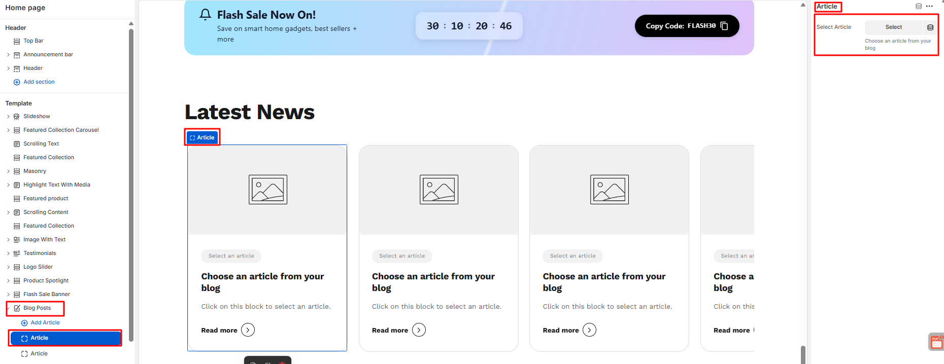
How to Configure Article
- Users can add as much as Article as they want.
- Users can set the article from the right side.
- Save
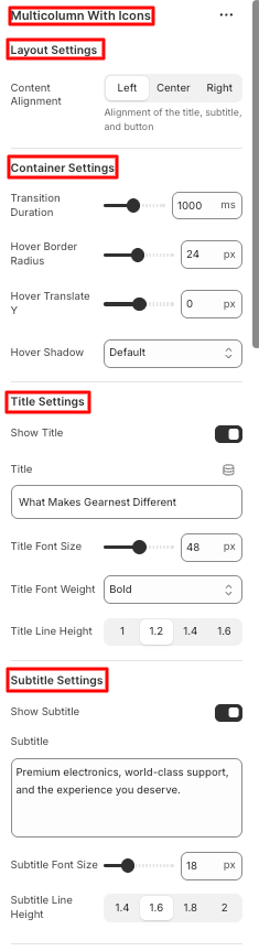
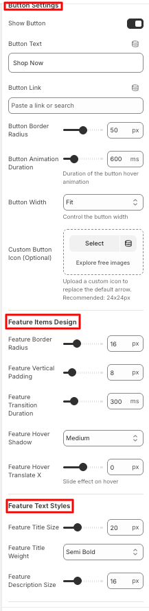
2.16 Multicolumn with Icon
How to configure Multicolumn with Icon
- Click on the Multicolumn with icon in the theme editor section on the left side.
- Then, do the following modifications on the multicolumn with icon..
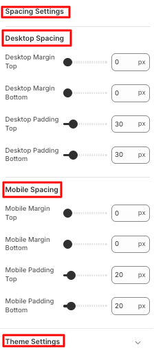
- Starting from layout, container, title, subtitle, and button settings, Feature item design, feature text styles and space settings
- Lastly they can change the global color scheme inside theme settings.
- Save
How to configure Feature Item
- Users can add as many Feature item blocks as they want under the multicolumn with icon section
- Click on the feature item block under the multicolumn with icon section on the left side panel.
- The configuration settings are on the right side of the editor.
- Users can customize feature content and feature link & arrow.
- Save
2.17 Quick Info
- Click on the Quick Info under templates in the theme editor section on the left side.
- Then, do the following modifications on the multicolumn with icon..
- Then, do the following needful configuration.
- Starting from general settings, divider settings, spacing, bottom line bar, spacing settings, and theme settings.
- Save
How to Configure Contact Item
- Users can contact item blocks according to their wish.
- Users can change the contact item starting from label, text, link URL, link text , upload icon, and show divider on the right side panel.
- Save
3. Product Page
3.1 Breadcrumb
How to add Breadcrumbs
- On the left side of the theme editor, find the template section, there click on breadcrumbs to add it.
- On the right side panel, configure the breadcrumb by modifying the appearance, responsive alignment, and spacing along with theme settings.
- Save
3.2 Product
How to add Product
- Go to the template section on the left side panel of the editor click on the product section.
- Configure the necessary changes on product details. Users can also add additional information along with brand information.
- Users can enable pickup availability and social sharing.
- Lastly, they can change the global color scheme in theme settings.
- Save
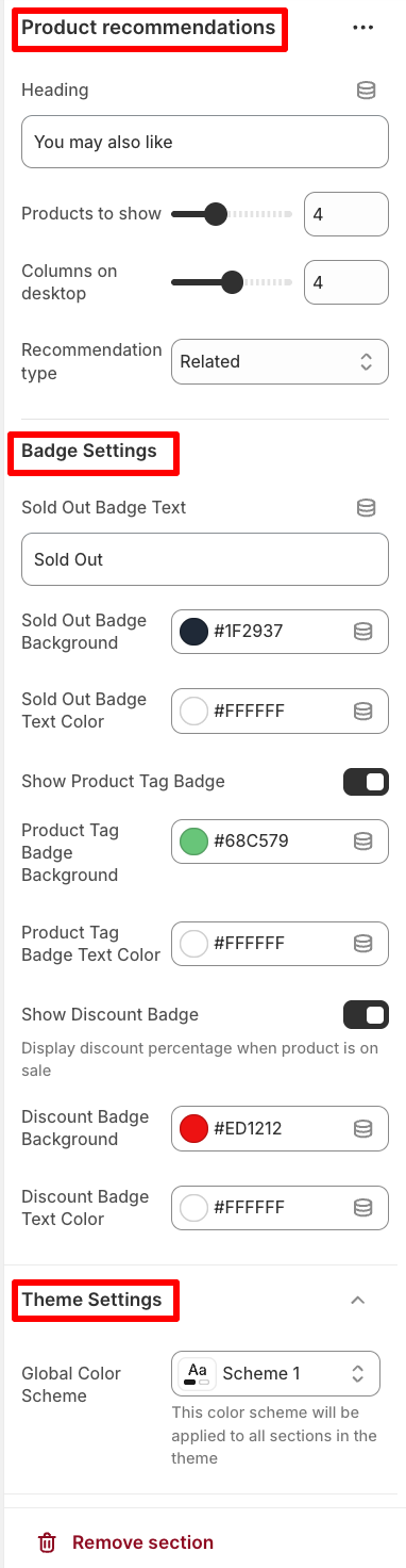
3.3 Recommended Products
How to add a product recommendation
- Go to the template section on the left side panel of the editor click on the product recommendations section.
- Configure the necessary changes on the right side panel.
- Users can add heading text and modify the no of products to show and the columns to be displayed on desktop.
- They can also modify the recommendation type to related or complementary.
- Users can change badge settings.
- Lastly, they can change the global color scheme in theme settings.
- Save
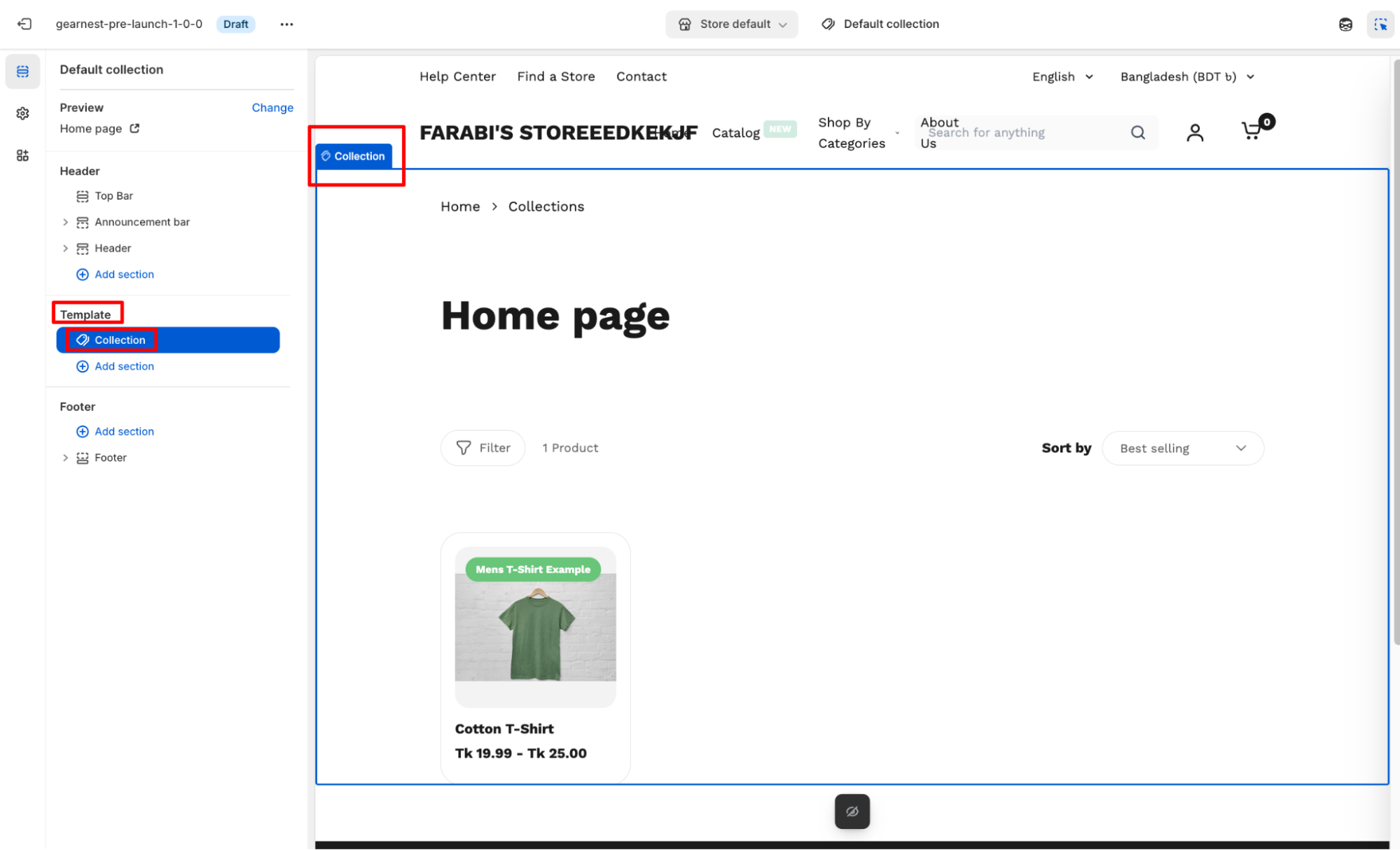
4. Collection Page
4.1 Collection
- Go to the template section on the left side panel of the editor click on the Collection section.
- Configure the necessary changes on the right side panel.
- Save
5. Collection List Page
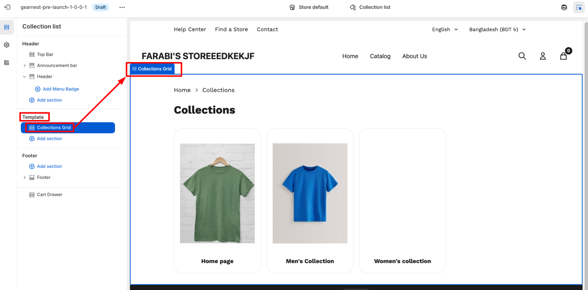
5.1 Collection Grid
How to configure a Collection Grid on the editor
- Go to the template section on the left-hand panel of the editor, then click the collection grid.
- Configure the necessary changes on the right side panel.
- Users can determine the grid item width on Mobile between small and large
- The image ratio can be chosen from variations
- Users can choose the grid spacing and items per page to be displayed
- Lastly, they can change the global color scheme in theme settings.
6. Gift Card Page
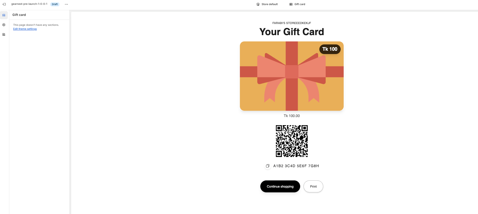
A Gift Card Page in Shopify is the dedicated page where a customer can view, download, print, or redeem a gift card after purchasing it. Shopify automatically generates this page with the gift card’s unique code, QR code, balance, and expiry details.
7. Cart Page
How to configure Cart
- Go to cart section under template on the left side panel of the editor.
- Click on the cart and a right side panel opens up for configuration.
- Configure the necessary changes on the right side panel.
- Users can modify cart settings starting from enabling/disabling vendor,cart note,cart attribute display.
- They can also chage the cart attribute name,label and placeholder.
- Lastly user can change the top and bottom padding.
- Save
8. Blog Page
8.1 Blog
How to add a Blog to your Shopify store
- Go to the template section on the left-hand panel of the editor, then click the blog section.
- Configure the necessary changes on the right side panel.
- Users can show the blog title and change layout settings as to how many articles will be shown per page, to cards to be shown per row.
- Button text can be modified.
- Users can change the card design, border, and shadow, and enable the card hover effect and arrow border as well.
- The pagination design, border, and shadow can be configured by users.
- Users can modify the section spacing, padding, and margin for both desktop and mobile.
- Lastly, they can change the global color scheme in theme settings.
- Save
8.2 Product Spotlight
Refer to the Product Spotlight section.
8.3 Featured Collection
9. Article Page
9.1 Article
How to add an Article to your Shopify store
- Go to the template section on the left side panel of the editor click on the article section
- Configure the necessary changes on the Shopify admin by navigating to Content>Blog Posts.
- Add a comment list and a comment form.
How to add a comment list block
- Go to the template section on the left side panel of the editor, click on the comment list block under the article section.
- Configure the comment box border radius.
- Save
How to add a comment form block
- Go to the template section on the left side panel of the editor, and click on the comment form block under the article section.
- Edit the comment form title and its alignment, along with the description. Change the dorm fields from input field border radius to text area border radius. Then edit the submit button text and alignment.
- Save
10. Search Page
10.1 Search
How to configure Search
- First, navigate to the template section on the left side panel of the editor, and click on the search section.
- Edit the search header from the page title to the search
- In the results display section, fix the no of results per page and enable/disable to show Product Prices, Sale Prices, Article Excerpts, Article Dates.s
- In the empty state, put the no results title and message.
- In case of badge settings, users can modify the sold put badge text, text color, and background. They can also change the text color and background color of the product tag badge and discount badge after enabling those.
- They can change the global color scheme in theme settings.
- Save
11. Password Page
11.1 Password
How to add a Password section to your Shopify theme
- Navigate to templates from the left panel and click on the Password Section.
- In the Configuration, the user can edit the heading and subheading text. The button label can be customized as well.
- Users can either enable or disable the social media icon display
- They can change the global color scheme in theme settings.
- Save
12. 404 Page
12.1 404 Page
How to add a 404 Page
- Navigate to templates from the left panel and click on the 404 page section.
- Configure the changes in content settings by editing the error title and button text.
- Adjust color settings but changing the color of the background, text, and link.
- Customize the gradient settings (from gradient start to end ) and button settings by changing the button background and text color. .
- Lastly, users can change the global color scheme in theme settings.
- Save
13. About Us Page
13.1 Hero Banner
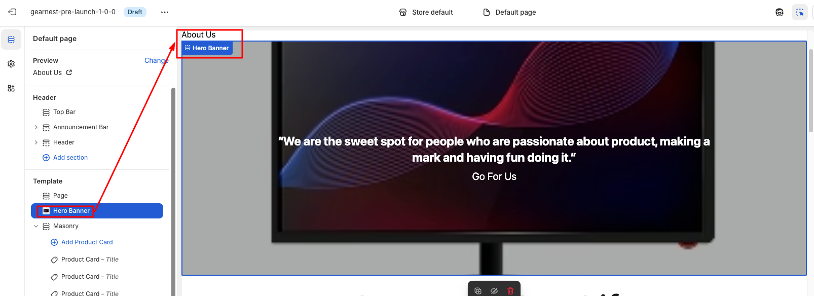
How to add Hero Banner
Steps:
- Go to the template section and click on add section to find the hero banner, then add it
- Configure the hero banner by putting a background image, heading, subheading, and changing text alignment
- Next, change the layout from content width to desktop height, enable/disable overlay, and change its color and opacity
- Enable;e/disable button and its text and its color, background color, and link, along with button border radius and color
- Users can adjust the icon circle background, color Lastly, users can change the global color scheme in theme settings.
- The transition duration can be set
- Save
13.2 Masonry
Refer to the Masonry section.
13.4 Testimonials
Refer to the Testimonials section.
14. Terms and Conditions Page
14.1 Terms & Policies
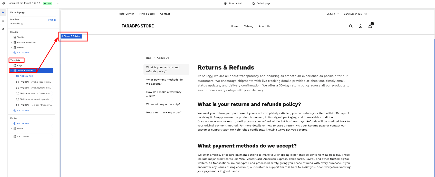
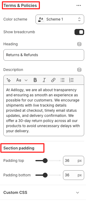
How to add the terms & policies section
- Go to templates from the left panel and click on the add section, then choose the terms & policies section.
- Configure the changes in the color scheme.
- Enable or disable breadcrumbs display
- Edit the text in the heading and description
- Modify the section top and bottom padding
- Save
15. Contact Page
15.1 Breadcrumb
Refer to the Breadcrumb section.
15.2 Contact Form
How to configure the contact form section
- Navigate to templates from the left panel and click on the contact section
- To configure it, go to the right panel of the editor
- Customize the text of the submit button
- Enable/disable the country and order number field
- Adjust the text inside name, email,phone, order number, message placeholder \
- Modify the section top and bottom padding
- Lastly, change the global color scheme under theme settings
- Save
